Skip to content

We the Power

We the Power
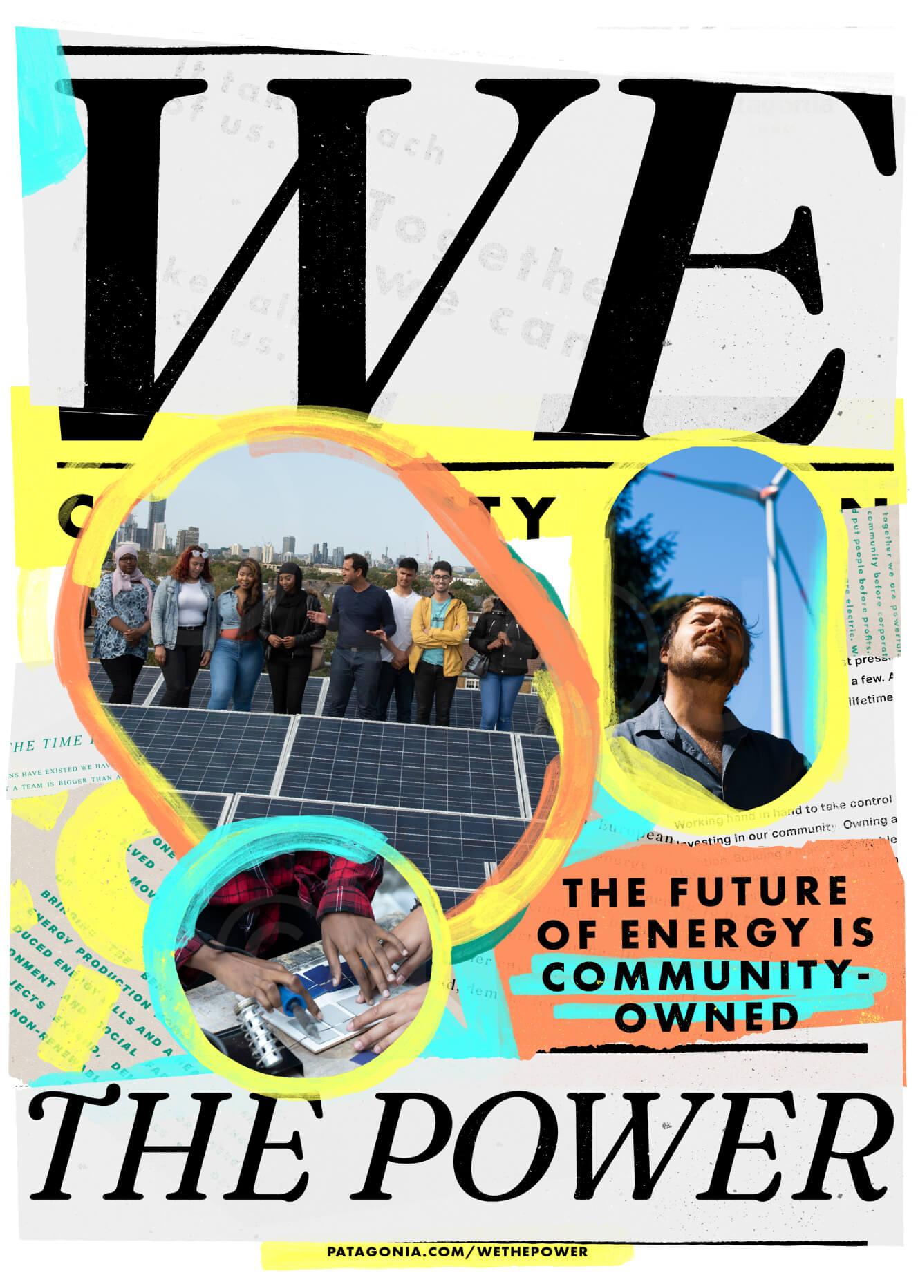
We the Power, a documentary film and initiative by Patagonia, encourages viewers to imagine a future of citizen-led, community energy initiatives that help combat energy poverty and put power, money, and decision-making back into the hands of individuals and communities. To prepare for the launch of this initiative, we crafted a unique identity which translates the spirit of the movement and empowers people to join, invest, create, or lobby for localized energy systems in their towns.
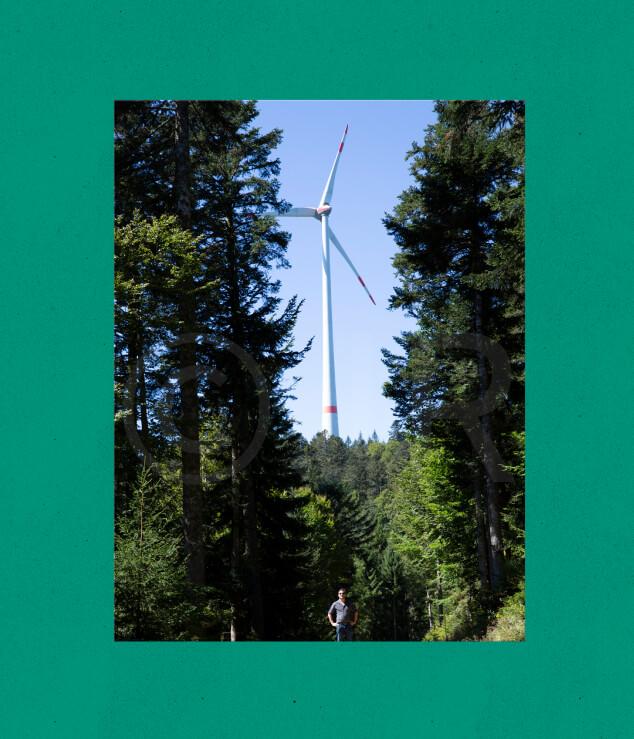
Wind turbine rising above a pine forest with a person standing below, framed in green
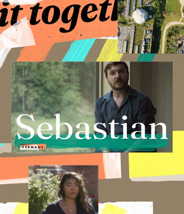
Film title treatment: the name Sebastian over a green brushstroke on an interview frame, set in a paper collage

Identity

The identity is a celebration of the power of “We”. It’s meant to capture that crackling magic that sparks when individuals and communities roll up their sleeves and tackle issues together. The DIY-aesthetic reflects the inherent creativity shown by community organizers and energy revolutionaries, and invites us all to participate in reimagining and remaking the future of energy.
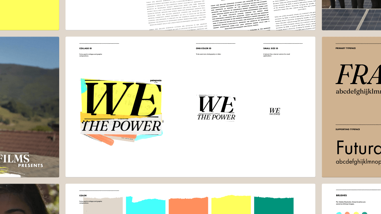
Brand book pages showing the We the Power logo in collage, one-color and small sizes, plus typefaces and colors
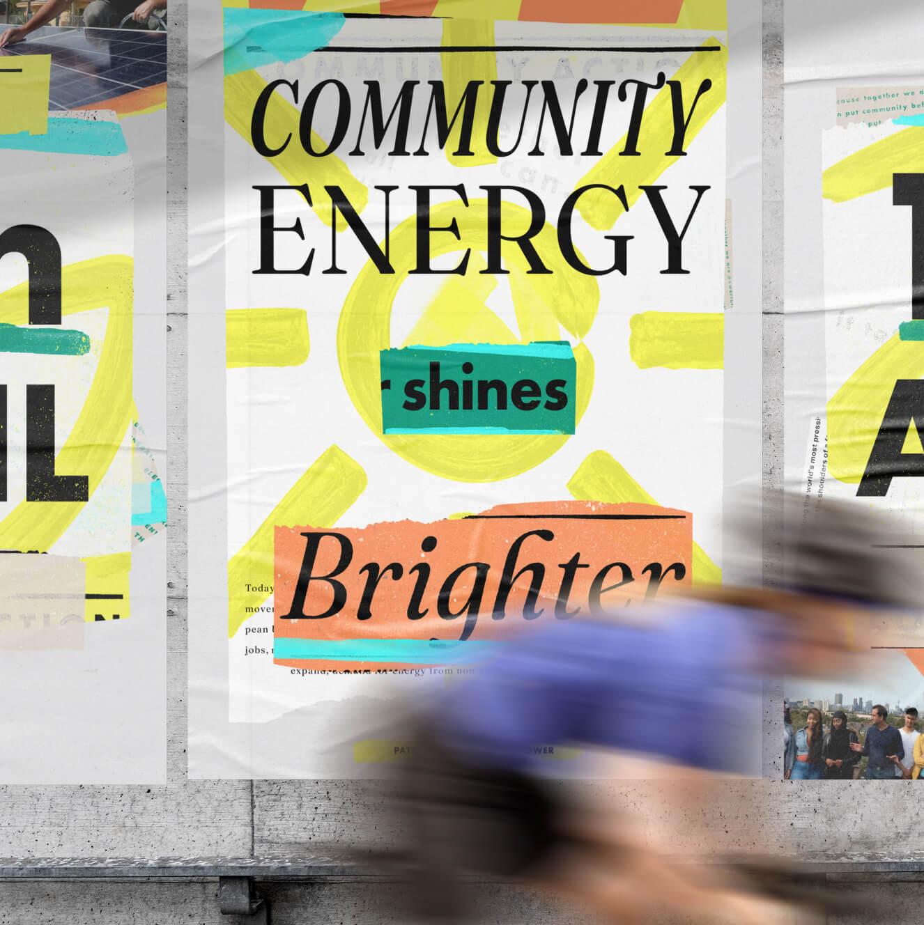
Street poster reading "Community energy shines brighter" over a painted yellow sun, with a cyclist blurring past
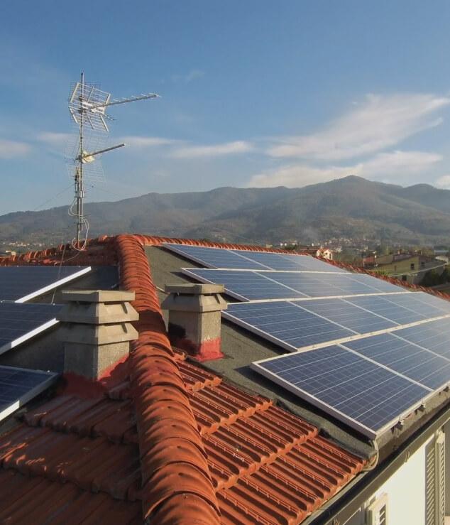
Solar panels on a terracotta-tiled rooftop with mountains in the distance
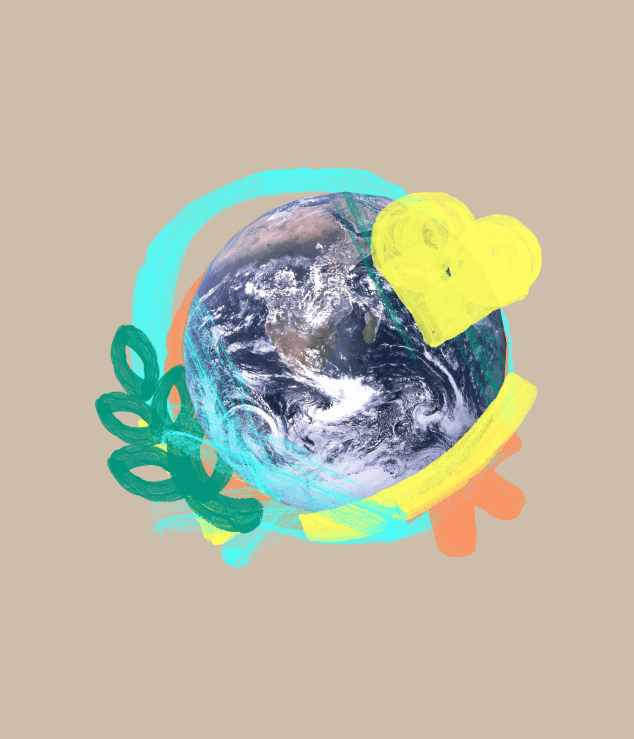
Photo of Earth circled with painted brushstrokes, a yellow heart and a green leaf sprig
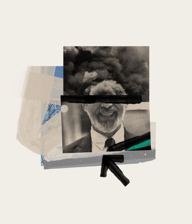
Collage of a halftone photo of a smiling man in a suit, his eyes struck out, under a cloud of dark smoke
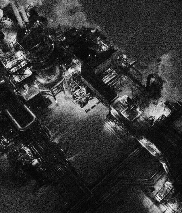
Grainy black-and-white aerial photo of an industrial plant at night
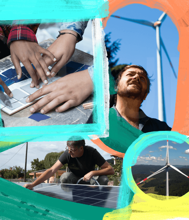
Collage of hands assembling a solar cell, a man installing a rooftop panel and wind turbines, framed by brushstrokes
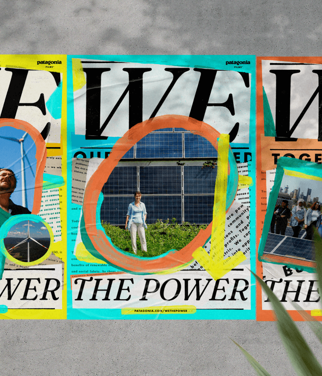
Three We the Power posters pasted on a concrete wall, each with photos of people and solar panels ringed in paint

Ultimately, the program was built to echo the DNA of the film and the movement — a pulsing drumbeat of heroes and hope, confidence and positivity, and most importantly, collaboration and community action
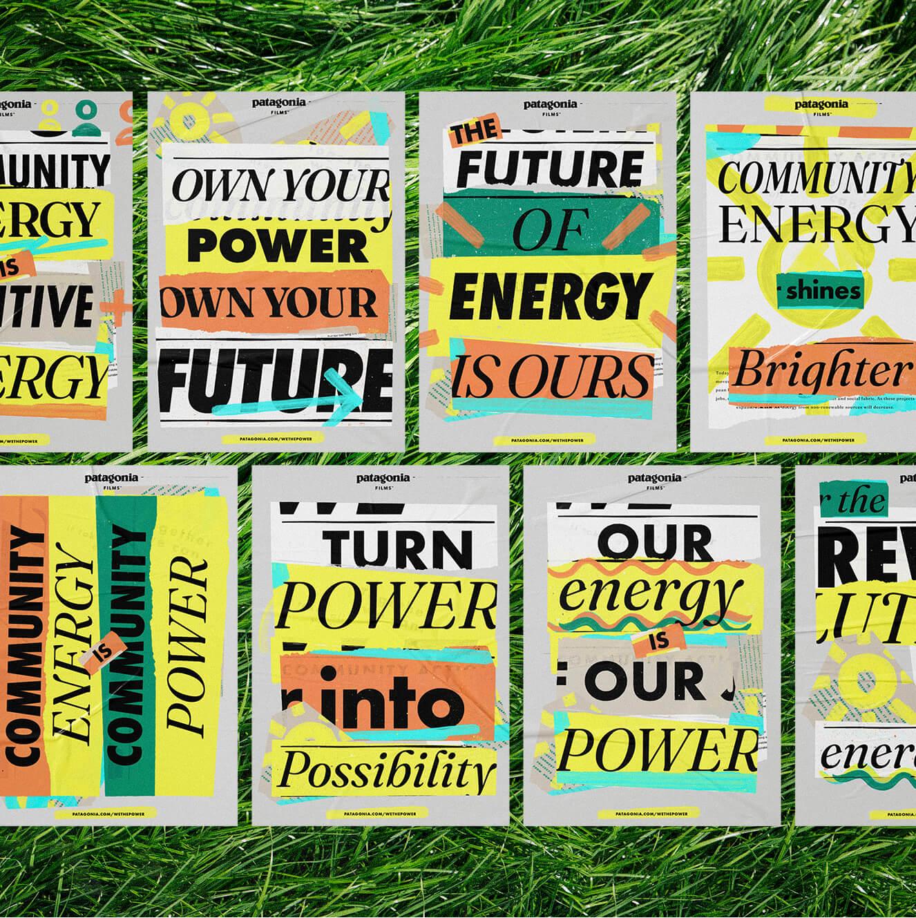
Eight typographic posters laid on grass, with headlines such as "The future of energy is ours"

The branding stretched across venues both traditional and digital: a localized teaser campaign in select spots throughout the UK and Europe, storefront displays, street posters, social media, websites, community outreach, and more. We made sure Patagonia was well armed with tools and graphics to launch a widespread media campaign. Because every movie deserves good typography, we looked at how our graphic language could extend into the film.

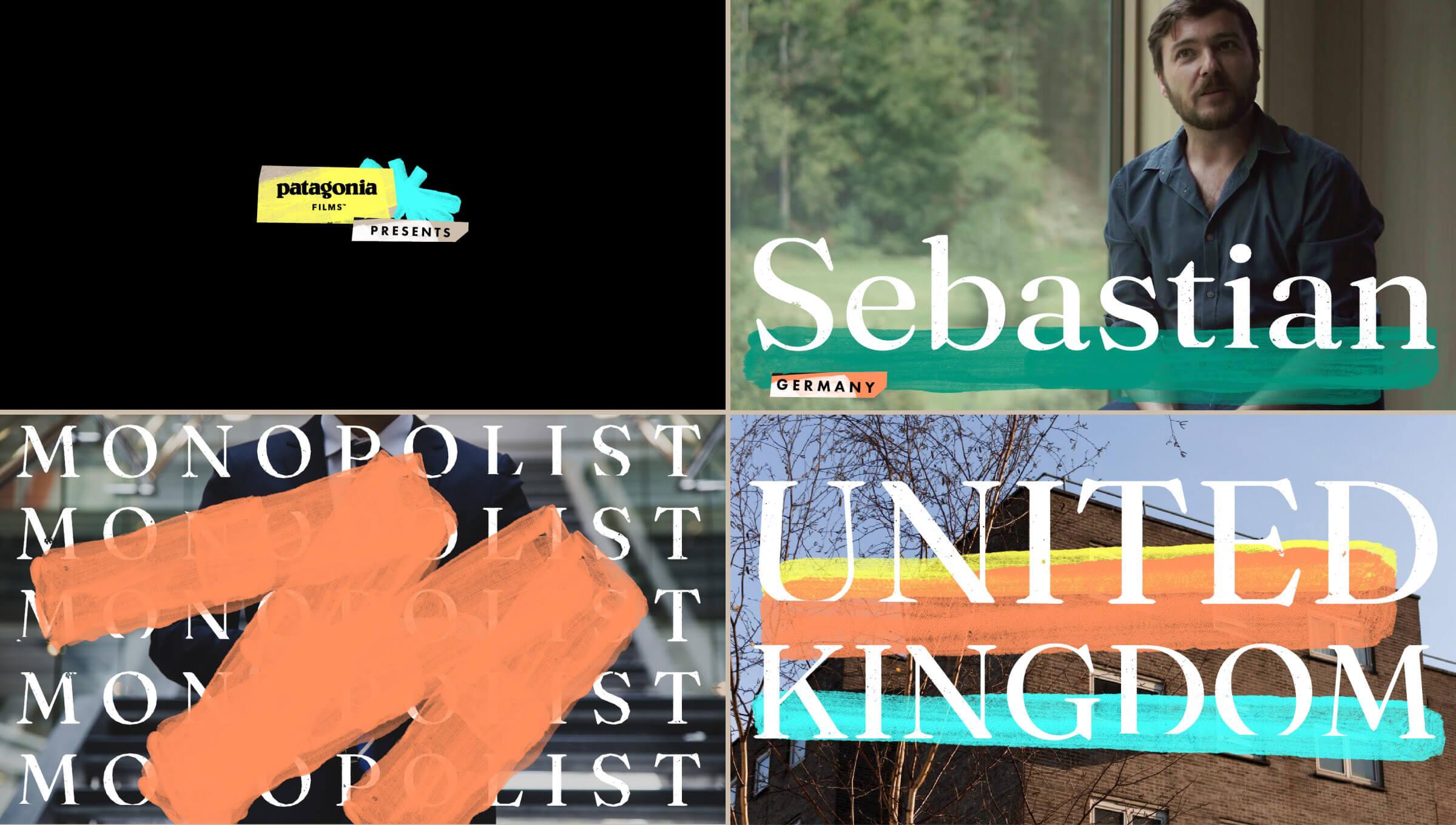
Four film frames: Patagonia Films Presents, the name Sebastian, the word Monopolist struck out, and United Kingdom

Setting our collages in motion lead us to a delightful stop-motion look. Our paint draws itself and photos shuffle into place — nothing can ever quite sit still. This tingling sensation is another reminder that this is an active and energetic movement. Our collage system continues to explode out in all directions. It’s exciting to see all its many permutations take shape.
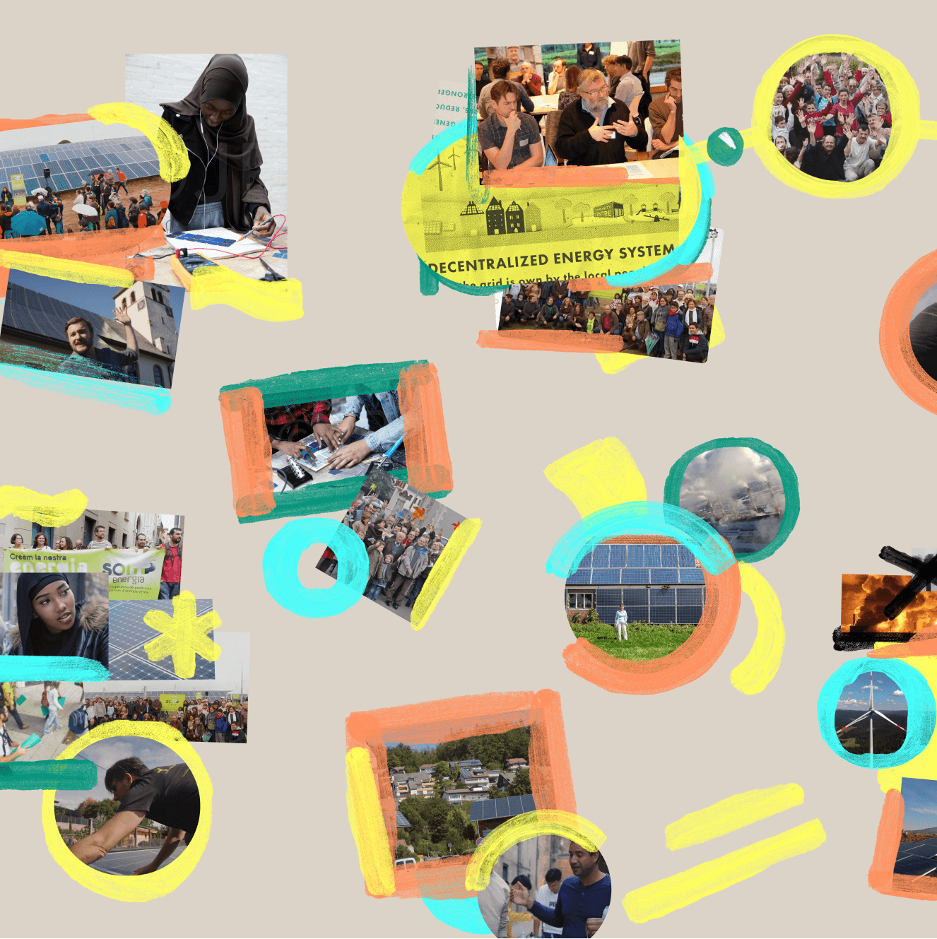
Community energy photos in painted frames and circles, scattered across a beige background
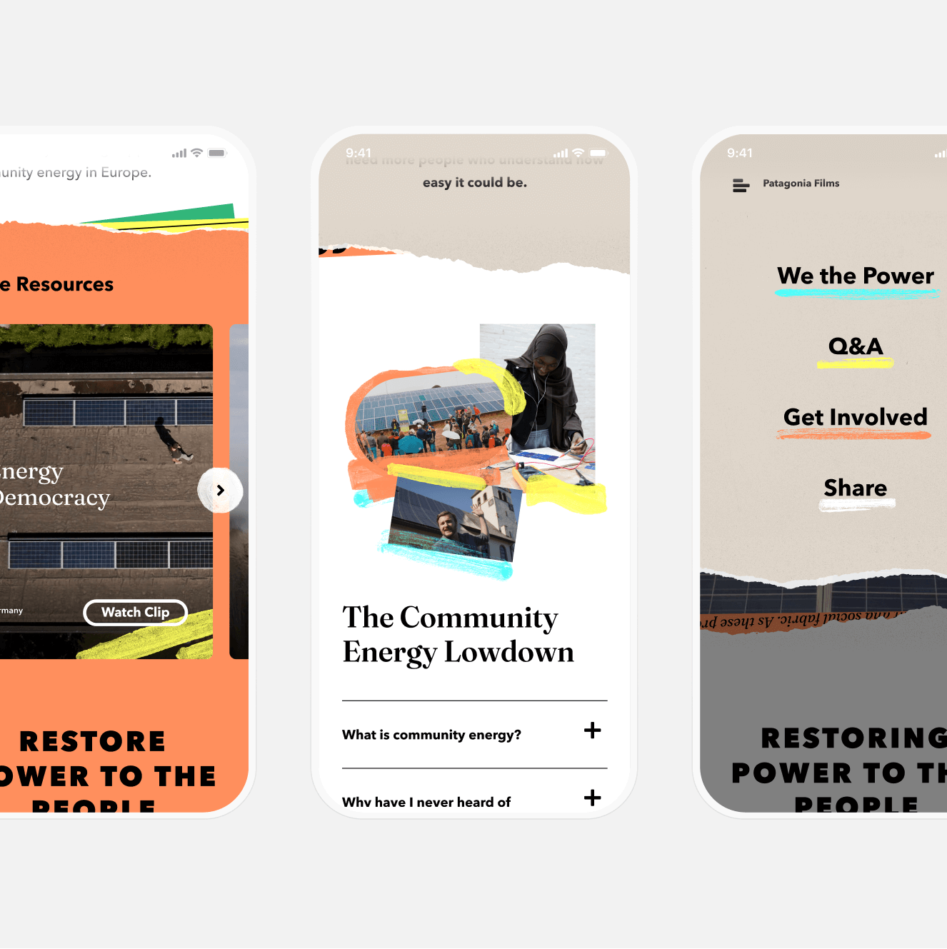
Three phone screens of the We the Power site: a film clip carousel, The Community Energy Lowdown FAQ and the menu
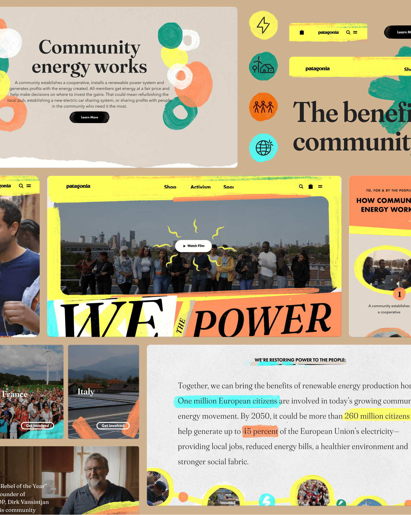
We the Power website pages, including the film hero with a Watch Film button and a Community energy works section
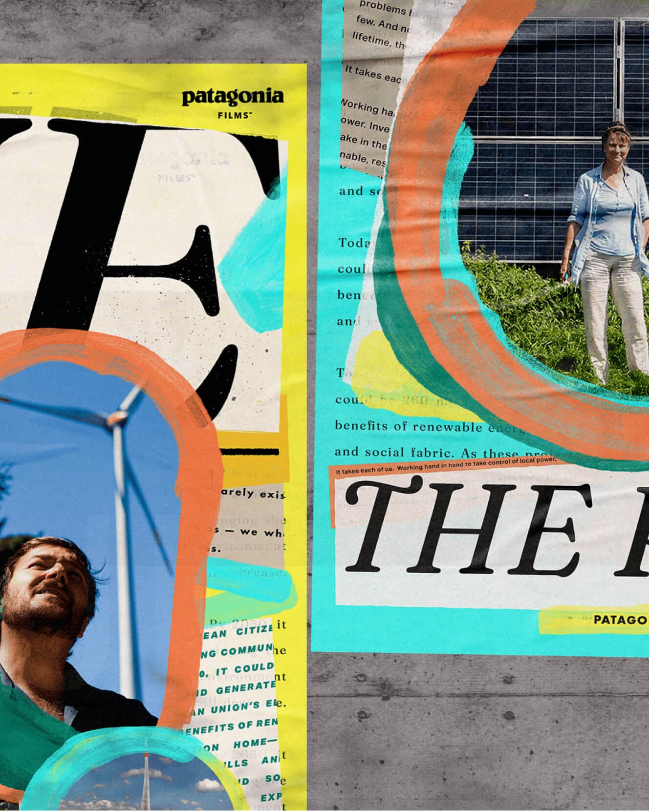
Close-up of two We the Power posters on concrete: a man beneath a wind turbine and a woman by a solar array

Press & Awards

Creative Boom

Creative Boom

Featured, 2021

Print Magazine

Print Magazine

Featured, 2021

Up next

Swipe