Skip to content

Jigsaw

Jigsaw is a unit within Google that explores threats to open societies, and builds technology that inspires scalable solutions. As the digital sphere becomes increasingly intertwined with the physical, basic human rights have become vulnerable on a whole new frontier. We worked with the team at Jigsaw to develop a new brand, website and publishing platform capable of supporting their audacious and important work.
Jigsaw logo in white on dark grey: a square with a circular bite cut from it, beside the wordmark
Jigsaw symbol outlined over enlarged puzzle-piece shapes, with a dashed diagonal line running through it
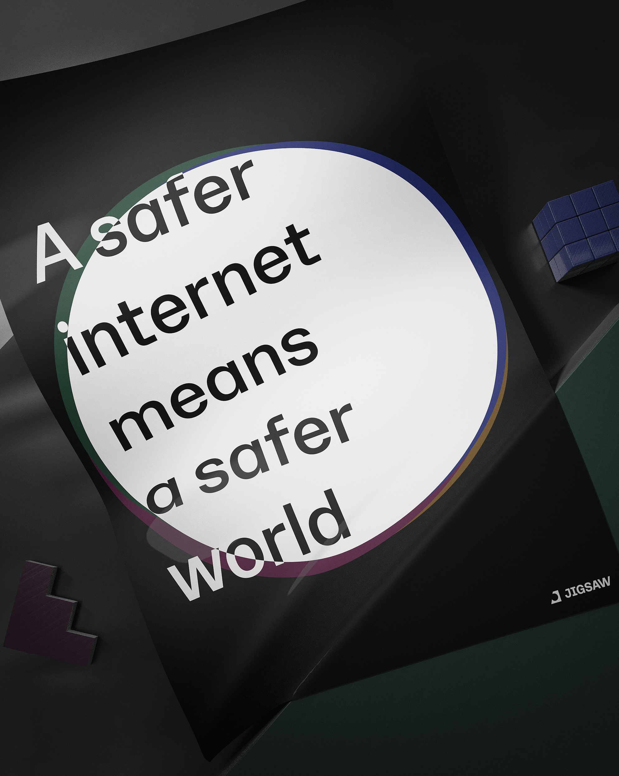
Poster reading "A safer internet means a safer world" across a white circle, with the Jigsaw logo in the corner
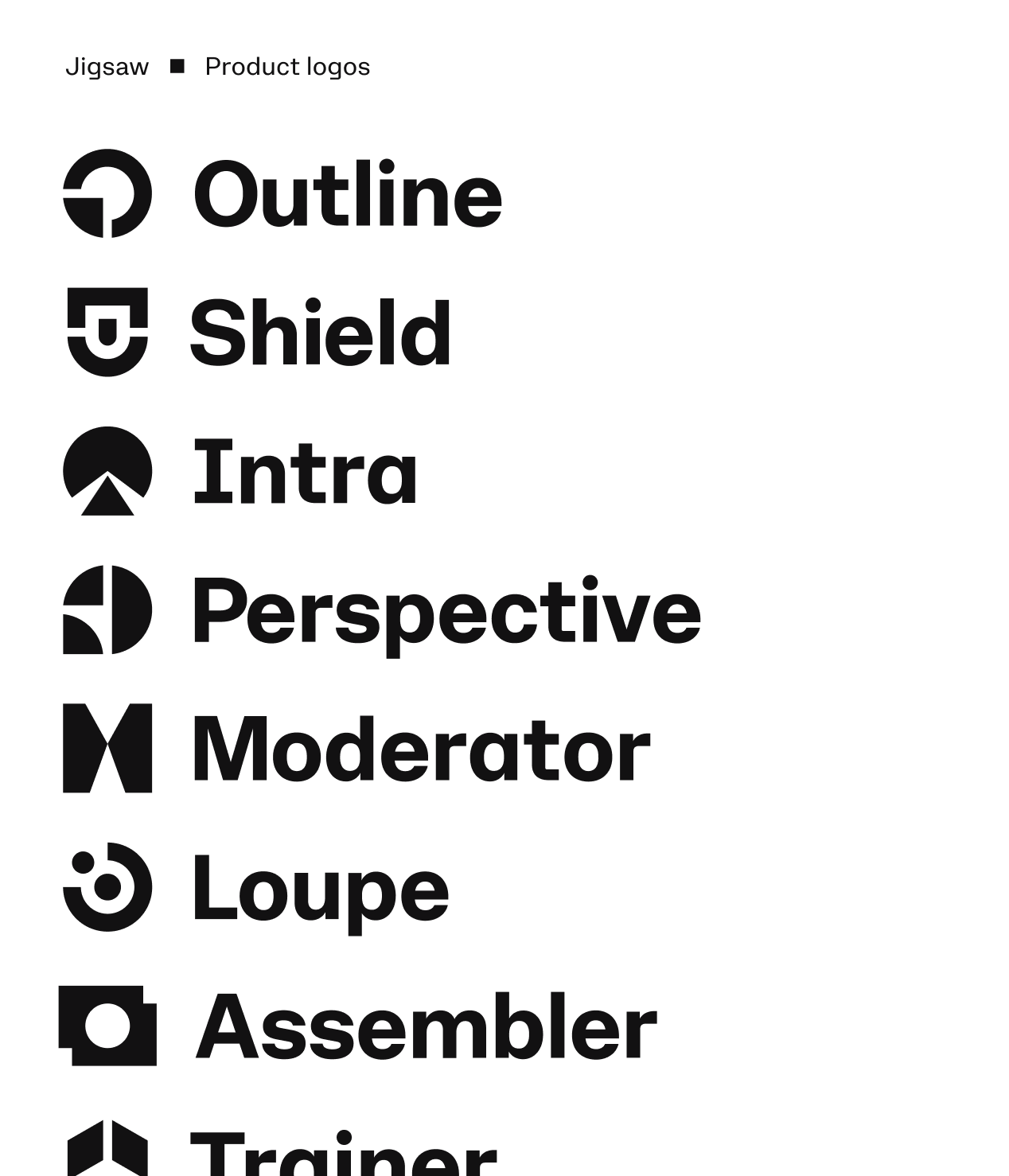
List of Jigsaw product logos: Outline, Shield, Intra, Perspective, Moderator, Loupe, Assembler, Trainer

Identity system

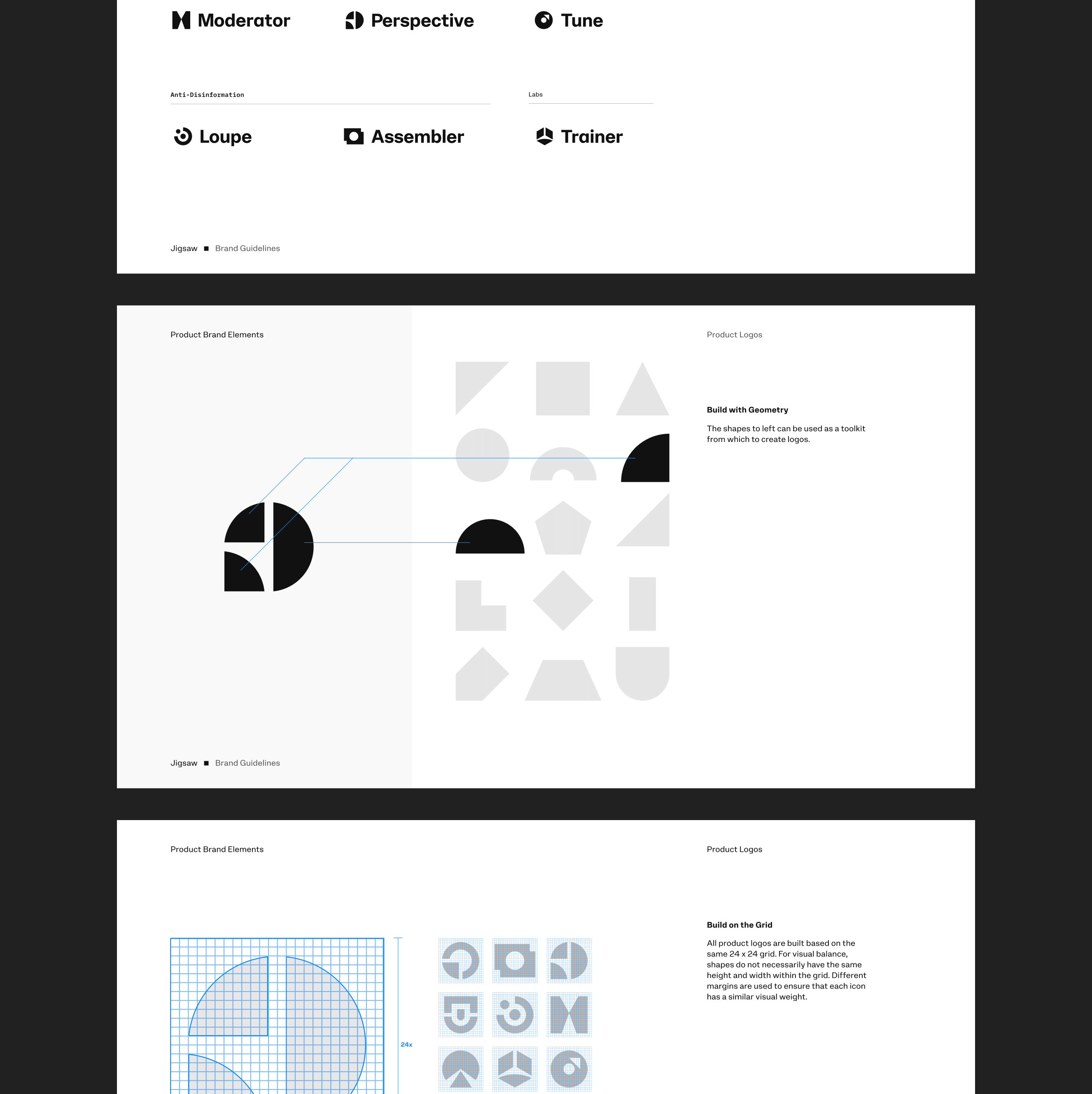
Jigsaw addresses emerging digital threats with an interdisciplinary approach that includes research, partnerships, projects and products. To celebrate each project and product as its own, we developed a flexible system for creating logos that allows the work to take on independent identities without losing connection to the broader Jigsaw brand.

Brand guidelines pages showing how product logos are built from geometric shapes on a 24 by 24 grid

Approach

Fragmentation, distortion, dimension, connection and illumination became consistent themes woven throughout our digital and print applications. We pushed the bounds of our geometry, color and type systems to create an extensive body of artwork that feels at once diverse and cohesive.
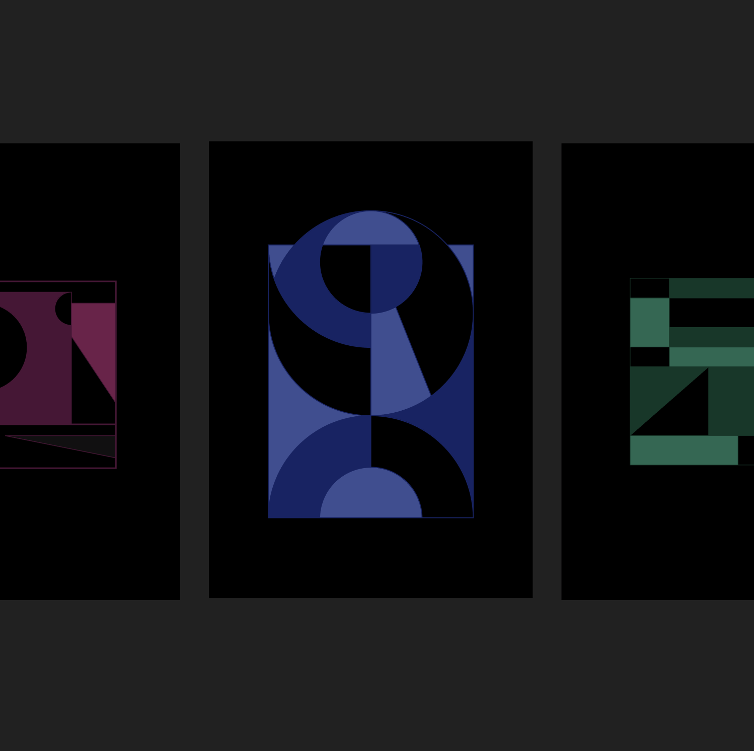
Three black posters with geometric compositions in magenta, blue and green
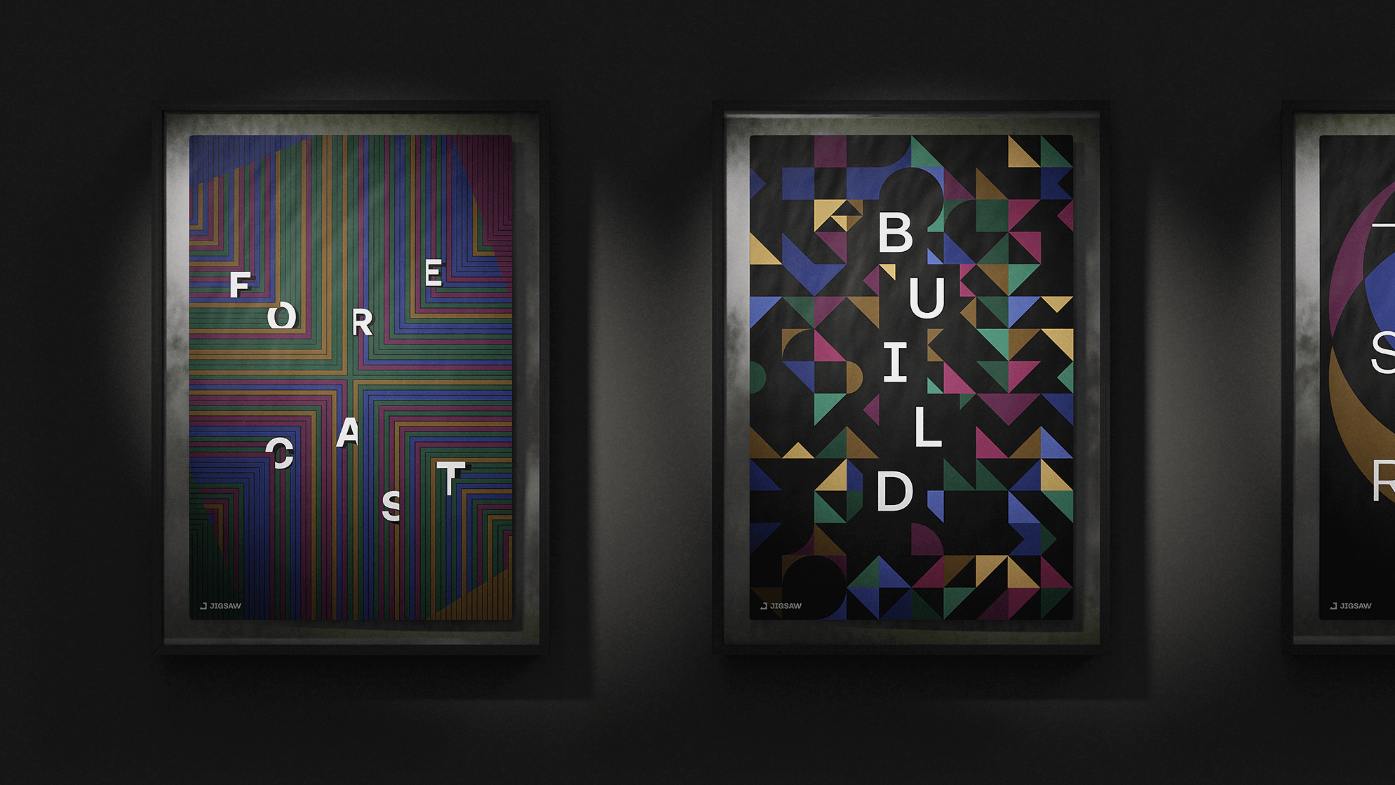
Framed posters on a dark wall with geometric patterns and the words Forecast and Build in scattered letters
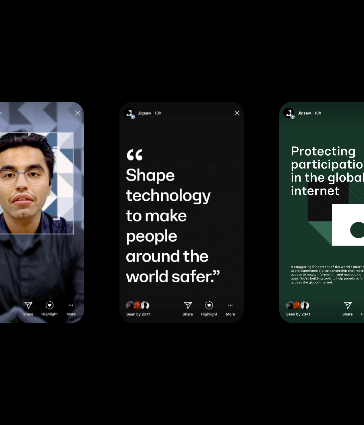
Three Jigsaw social stories on phone screens, one quoting "Shape technology to make people around the world safer"
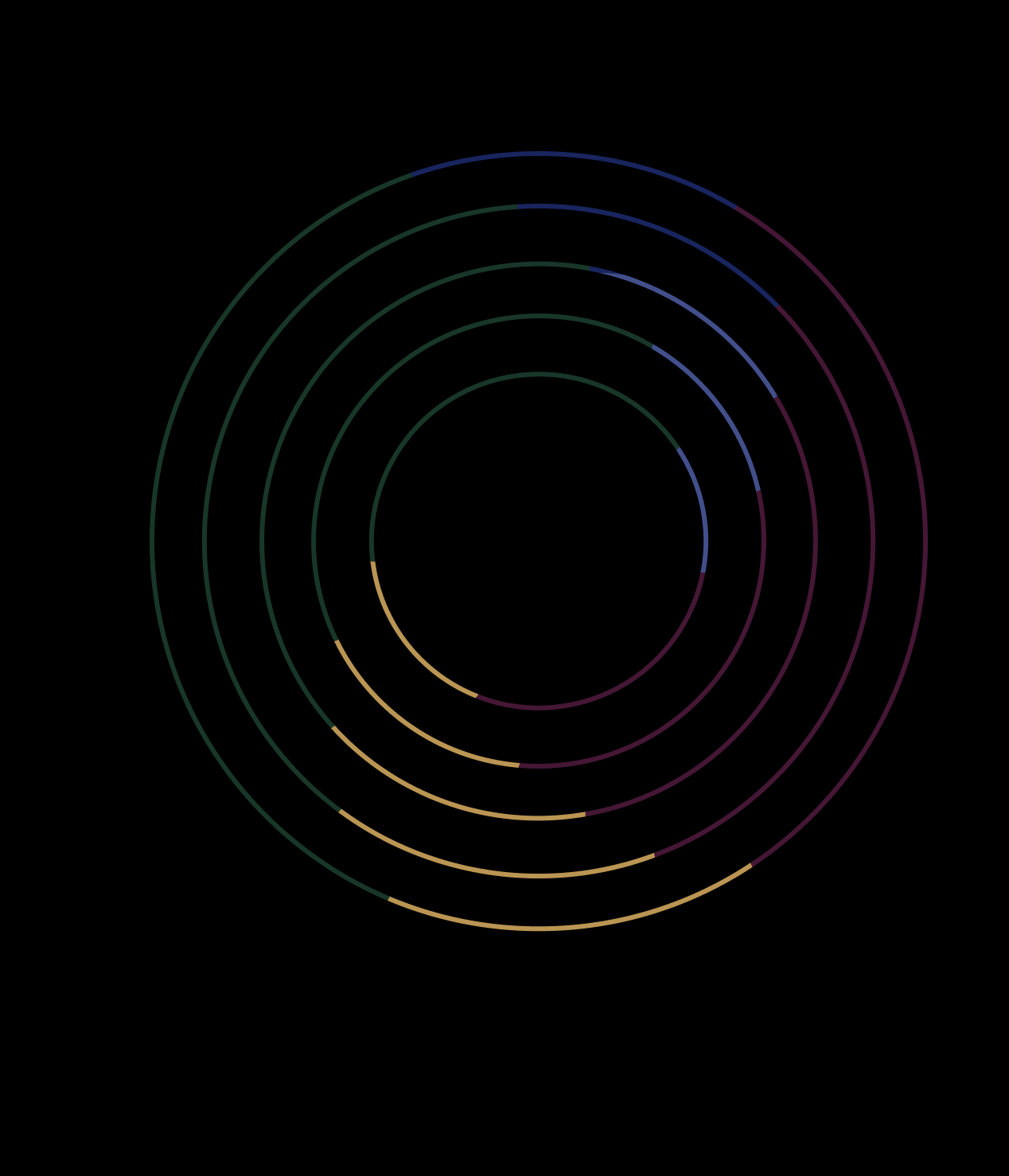
Five concentric circles drawn in thin green, blue, magenta and gold line segments on black

Because Jigsaw’s work often involves delicate, even dangerous, situations, we created Jigsaw Sans to reduce our reliance on imagery in the brand program.
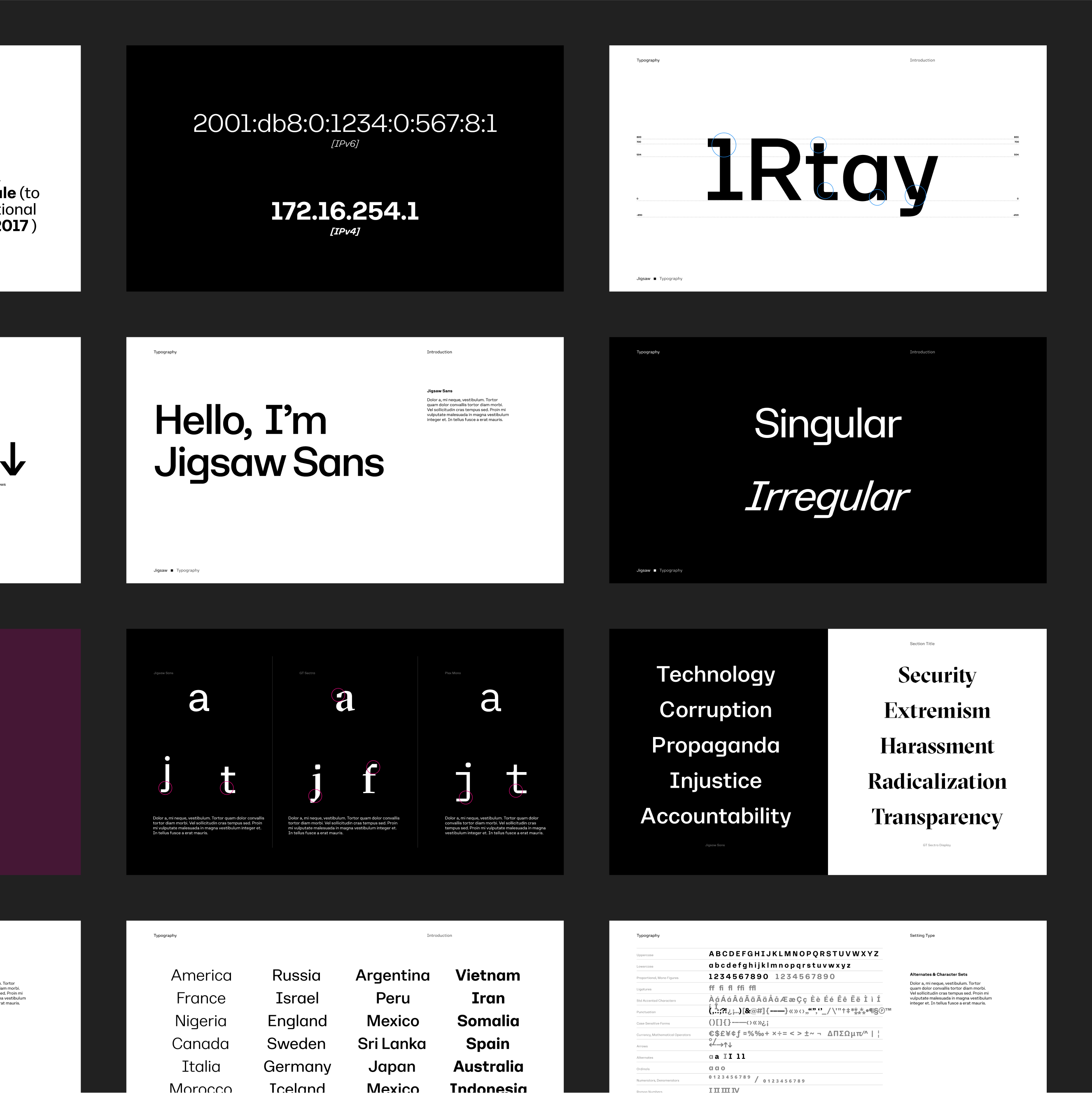
Typography guideline pages for Jigsaw Sans, including one reading "Hello, I'm Jigsaw Sans" and lists of country names
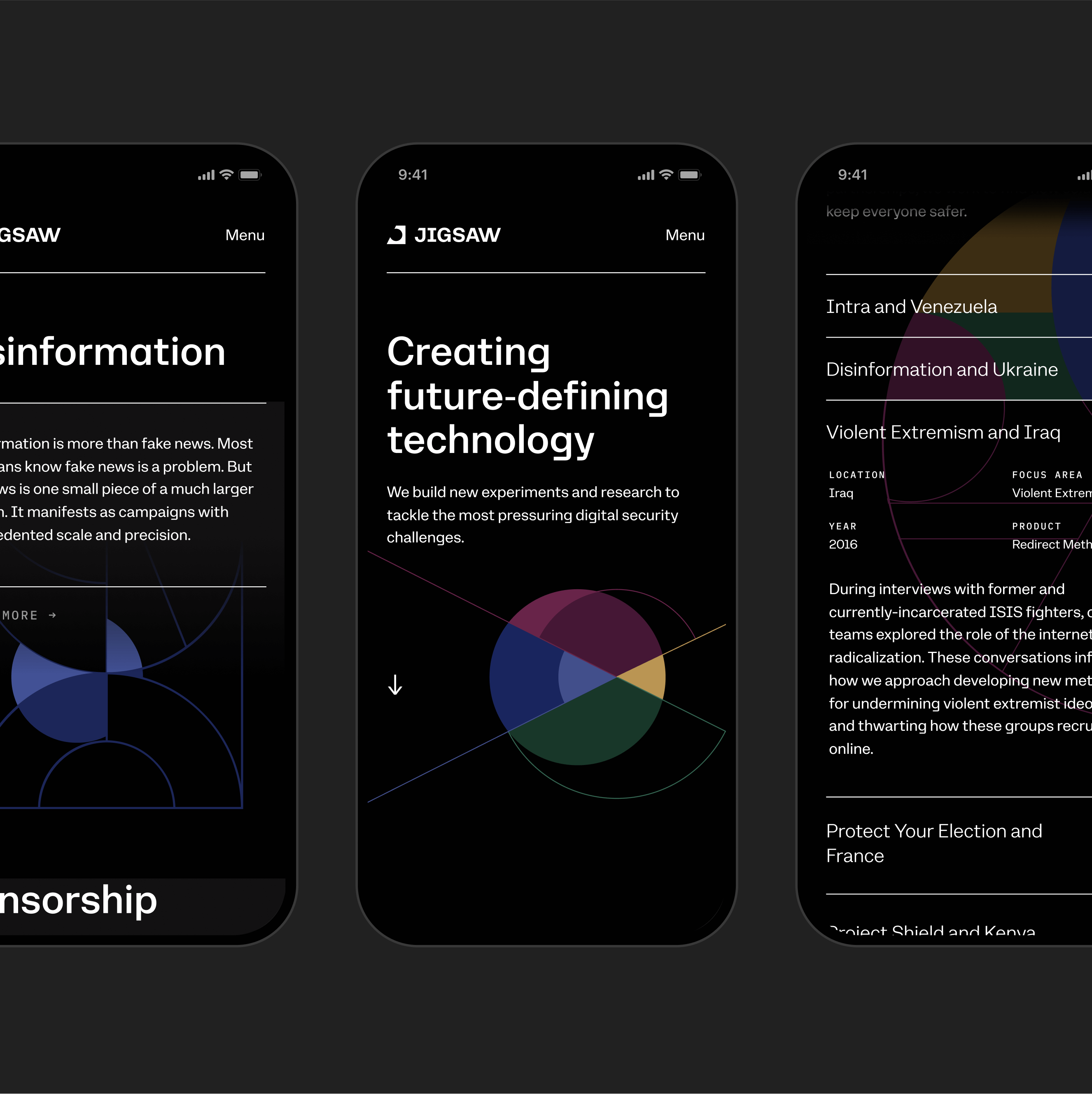
Three phone screens of the Jigsaw site, one headed "Creating future-defining technology" above a multicolored circle

The Current

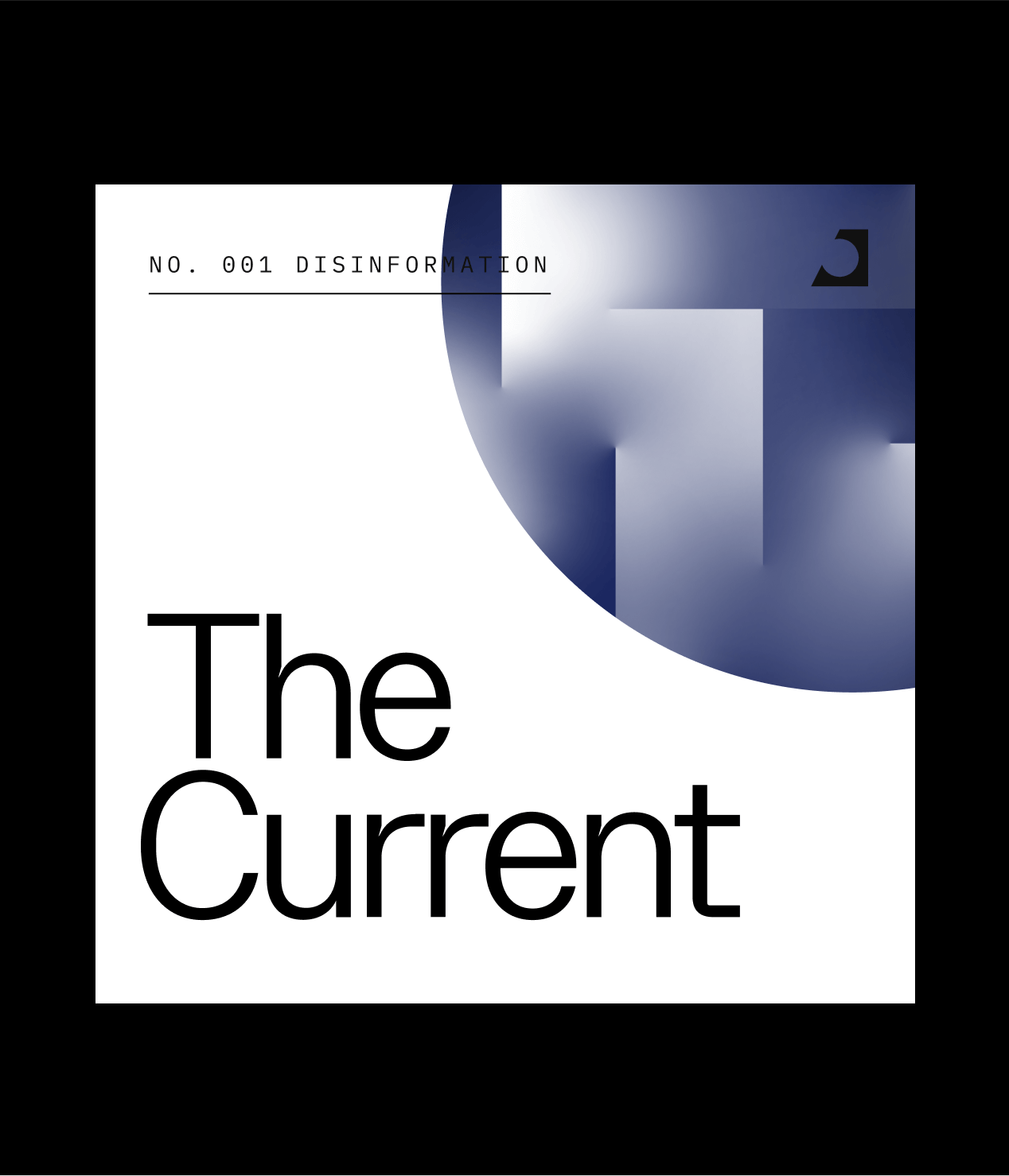
In collaboration with Jigsaw and Imprint Projects, we also launched The Current. The Current is a digital publication that explores a single issue in depth each release, with the goal of demystifying complex topics. To exude optimism, we set The Current landing page in white and elevated our serif font, GT Sectra, to create a more editorial feel.

Cover for The Current, No. 001 Disinformation, with a blurred blue circle on white

The Current explores the best combination of technology, data, style, format and storytelling the Internet has to offer.
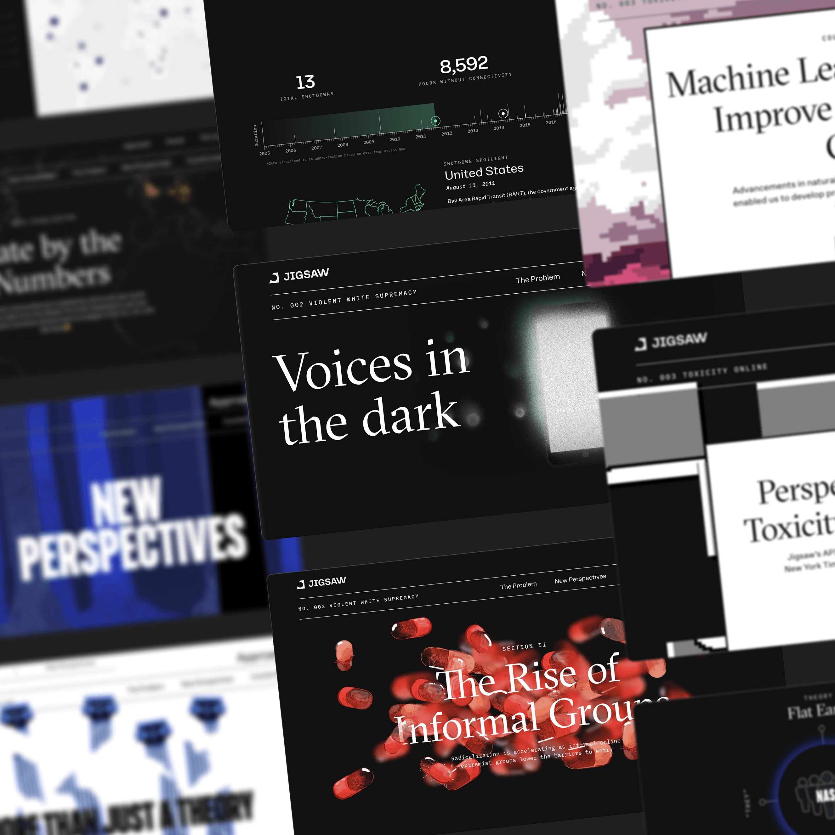
Angled collage of The Current article screens, including "Voices in the dark" and "The Rise of Informal Groups"
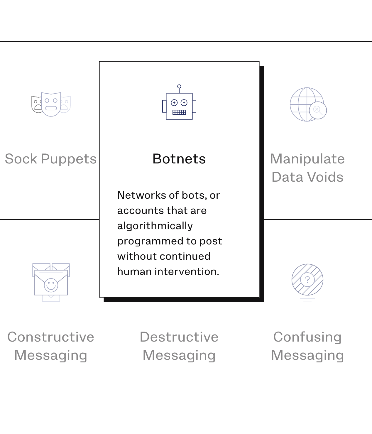
Grid of disinformation tactics with line icons, with the Botnets card raised to show its definition
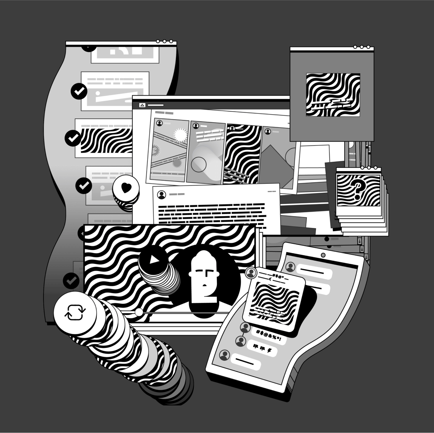
Black-and-white illustration of browser windows, chat bubbles, a phone and stacked share icons with wavy patterns

Press & Awards

Awwwards

Awwwards

Site of the Day, 2020

Developer Award, 2020

FWA

FWA

Site of the Day, 2020

Webby Awards

Webby Awards

2x Nominee, 2020

Brand New

Brand New

Featured, 2020

Up next

Swipe