Lightstep
Lightstep helps developers navigate their increasingly fragile software systems, so that when there’s an issue, they can find out what’s happening and why, fast. From healthcare and transportation to education and business, virtually every aspect of modern life is built on a layer of code. So developers today no longer have the luxury of moving fast and breaking things. We worked with Lightstep to create a brand that could cut through the complexity of the observability space with approachability and ease.
Strategy
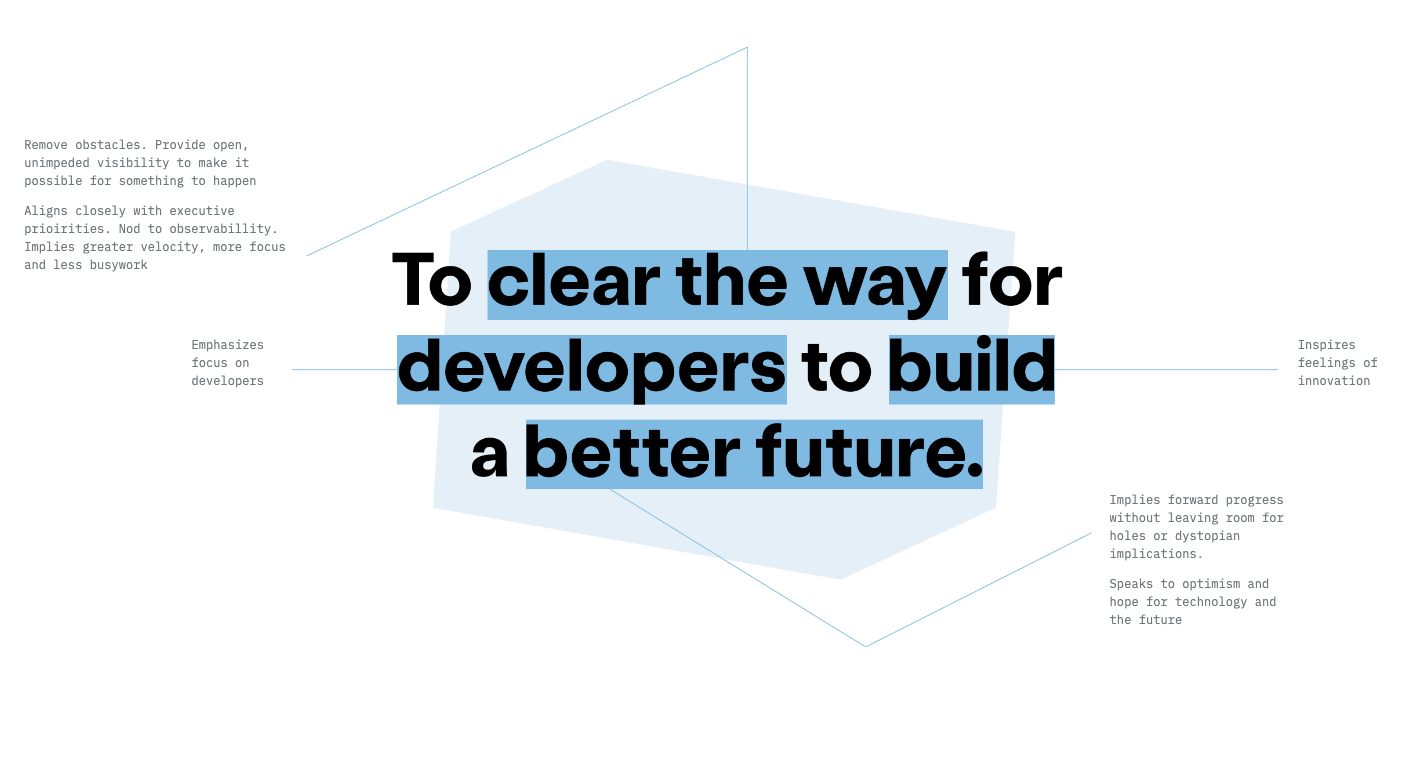
Managing deep systems can be chaotic. With unexpected firedrills and blame shifting across teams, the frantic search for solutions can breed a highly stressful environment. So we created a world of collective clarity. A world where developers can build products faster, push code with confidence and push the world forward.
Identity
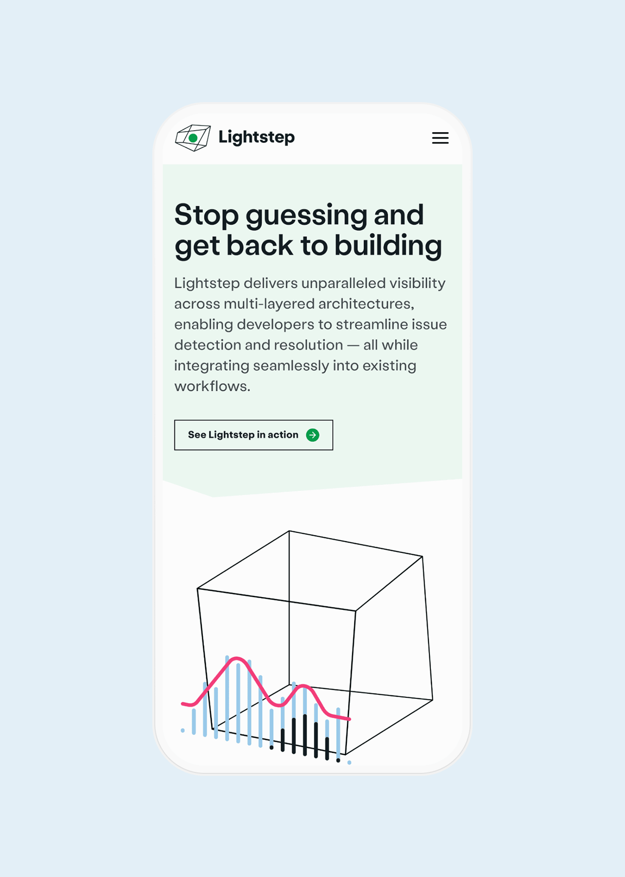
The mark exists in a constant state of evolution and transformation, offering a nod to the ever-changing nature of these technology systems. Angular and geometric, its exterior takes on endless variations. Yet for every shape it takes, there is always an insight to be found within.


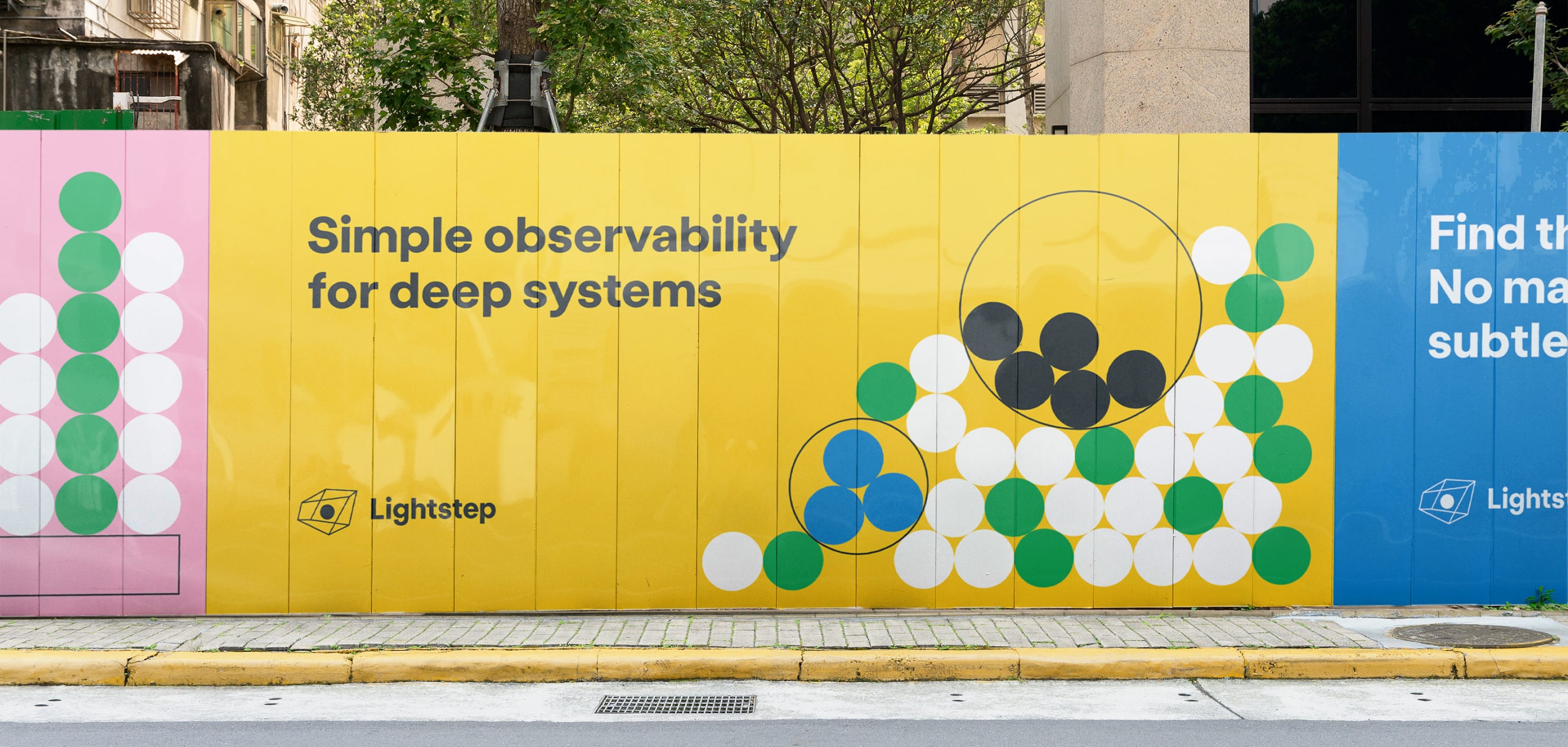
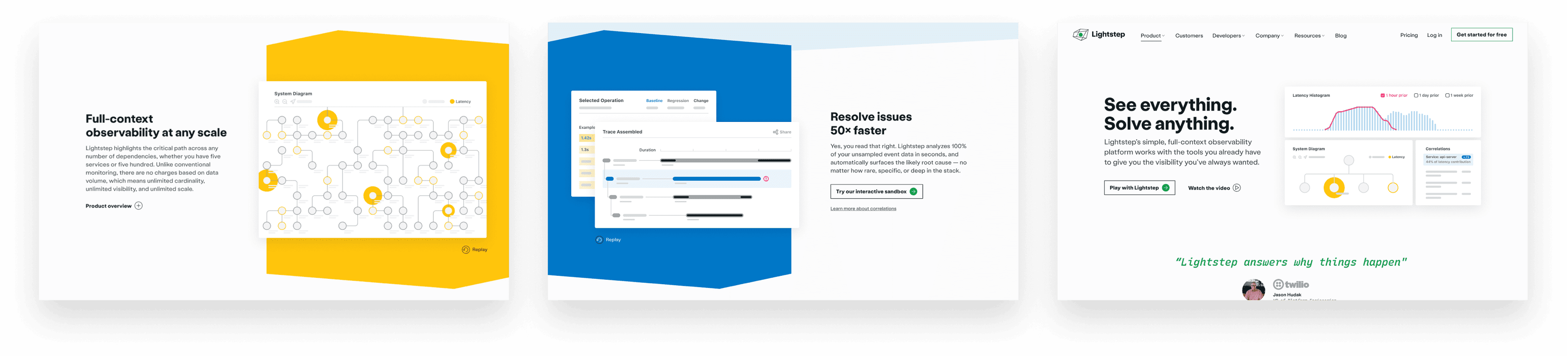
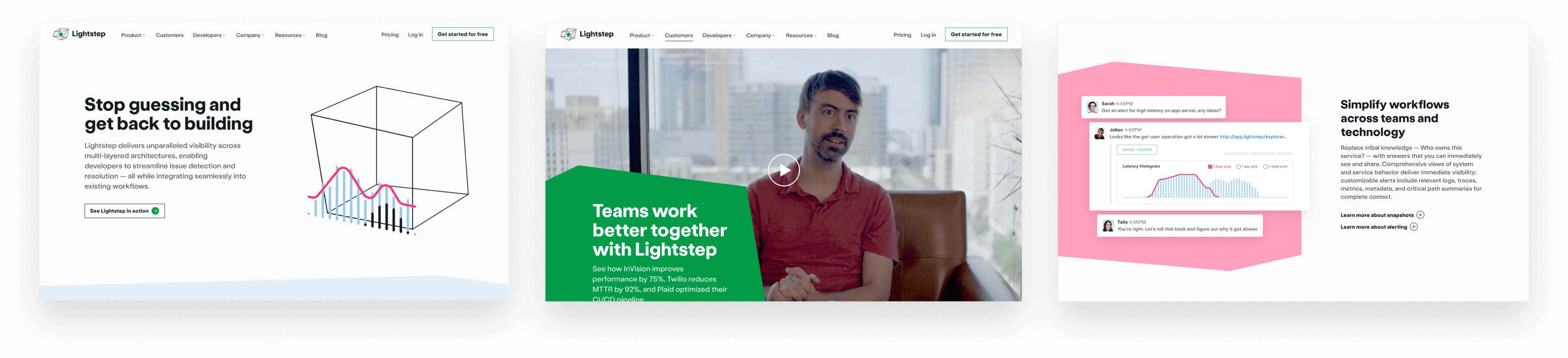
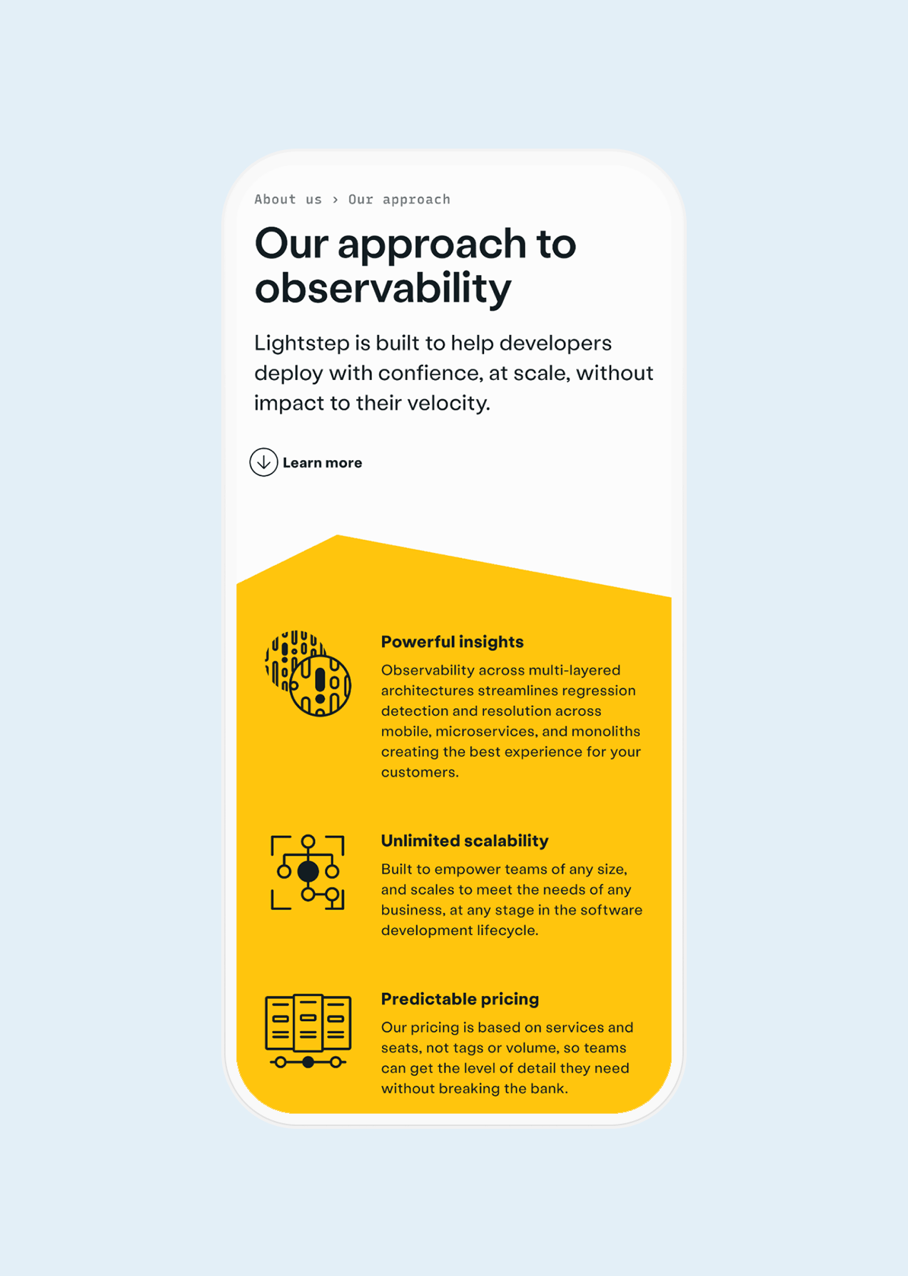
The silhouette of our evolving polygon became a core brand element to visualize a sense of relief from noise and complexity. Simple and flexible, these shapes easily adapt to become containers for artwork, text, floods of color and more. The palette is kept to just four brand colors, reinforcing the idea of clarity with optimism and delight.
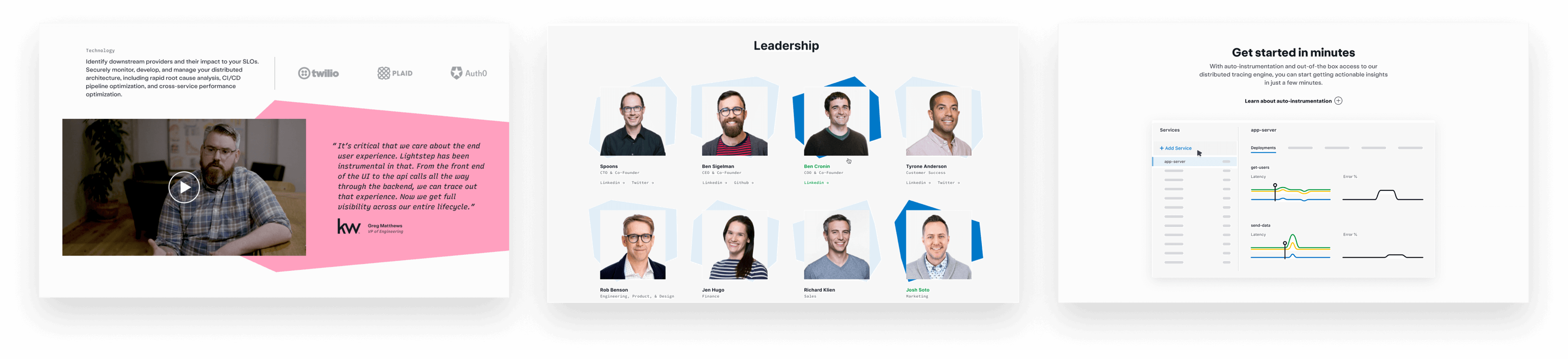
With a product that centers on dashboarding, data flow and statistics, Lightstep’s illustration style needed to balance technical detail and playful abstraction. Motion and interactivity were core to our approach, bringing the brand to life across applications and interfaces.
Services
Strategy
- Interviews
- Workshops
- Positioning
- Voice & tone
- Content
- Copywriting
Brand
- Identity
- Brand system
- Marks & symbols
- Art Direction
- Illustration
- Iconography
- Custom Font
Interactive
- UI/UX Design
- Visual Design
- Art Direction
- Motion Design