Skip to content

Stanford d.school

The Stanford d.school - or the Hasso Plattner Institute of Design at Stanford University - is a place where students use design to develop their own creative potential. We had the opportunity to work closely with the people at the d.school to design and build their website.

Our approach

We worked closely with the d.school to completely rethink how they could use a web platform. We interviewed the amazing people that make up the d.school and collaborated in workshops to organize content. We developed models of how the site could celebrate and amplify contributions from all parts of the d.school. Out of this process emerged a structure for the new website.
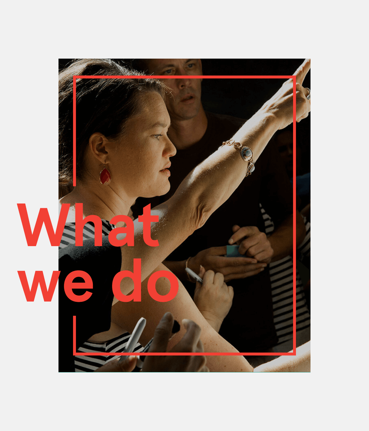

"What we do" headline in red over a photo of a woman reaching up to point, framed by a red outline
People standing in a circle in the d.school studio, laughing and clapping
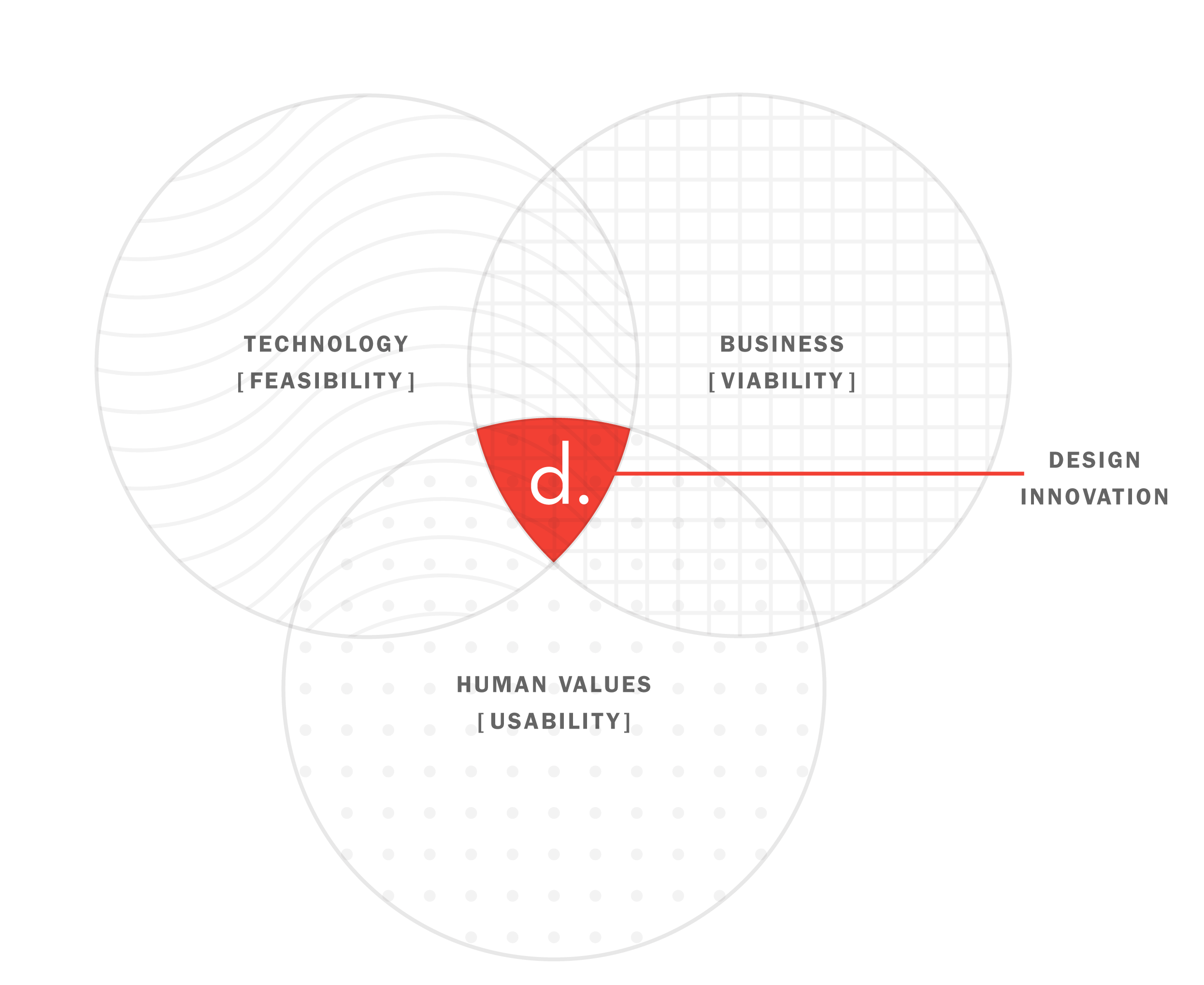
Venn diagram of technology, business and human values, with a red "d." at the overlap labeled design innovation
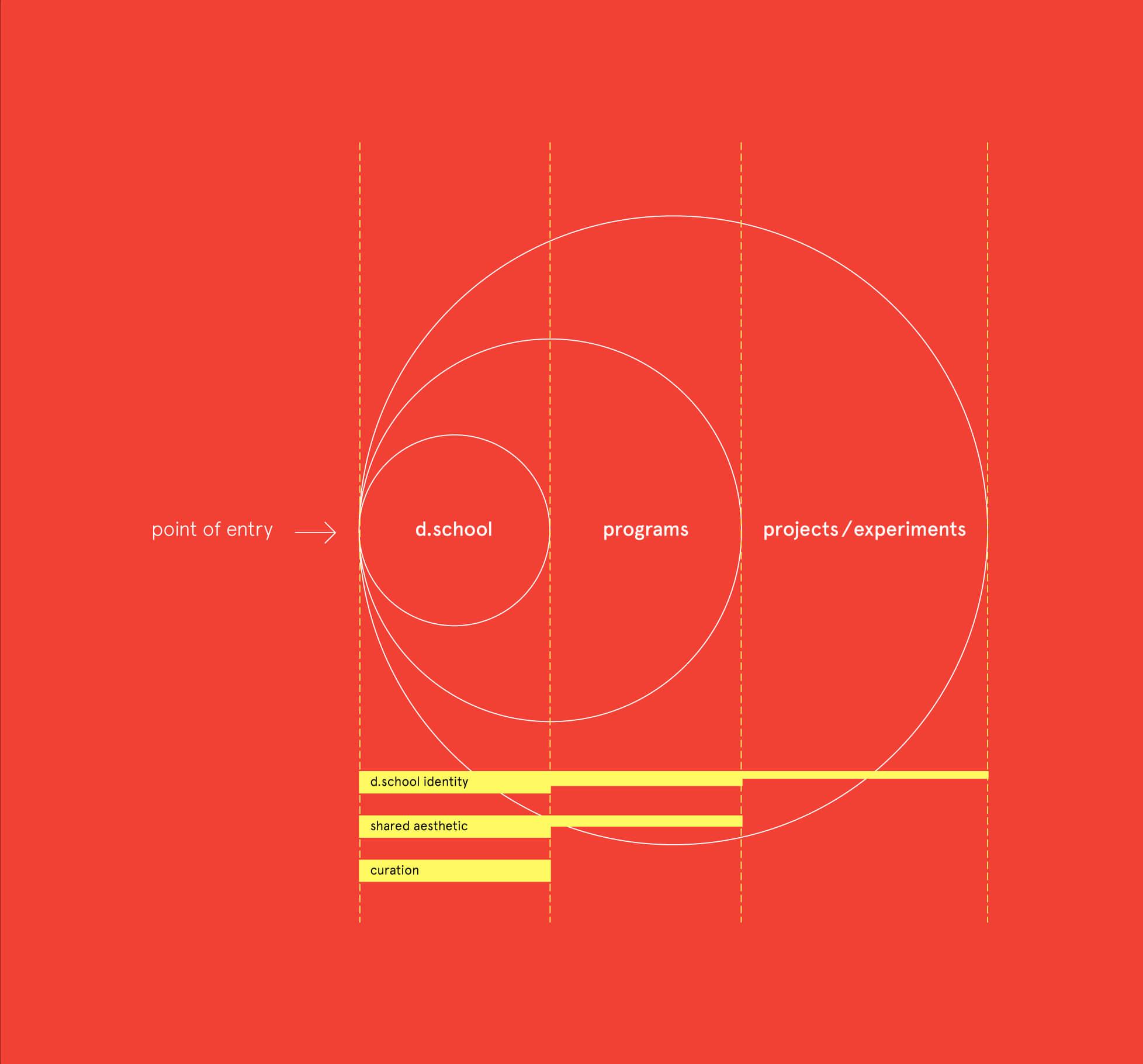
Diagram on red: nested circles labeled d.school, programs and projects/experiments, from a single point of entry
Smiling man writing with a marker on paper taped to a whiteboard
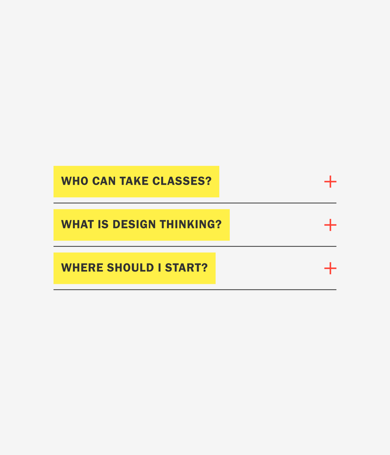
Three accordion questions highlighted in yellow, including "What is design thinking?", each with a red plus sign
Nine white line icons on green, including a graduation cap, light bulb, globe, handshake and crossed pencil and ruler
Man in a blue polo shirt speaking and gesturing to a seated group in a workshop

Our collective insight was an 'in-process' aesthetic — without looking unfinished — with grid lines that undulate and transform, representing the ever moving, ever evolving creative process.
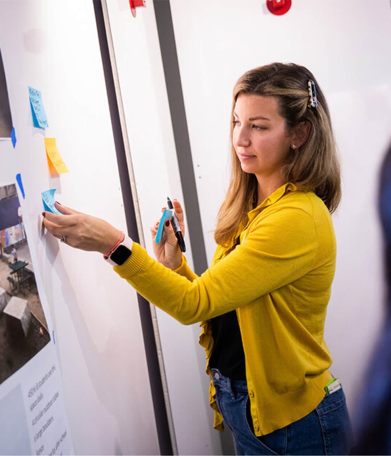
Woman in a yellow cardigan placing sticky notes on a whiteboard
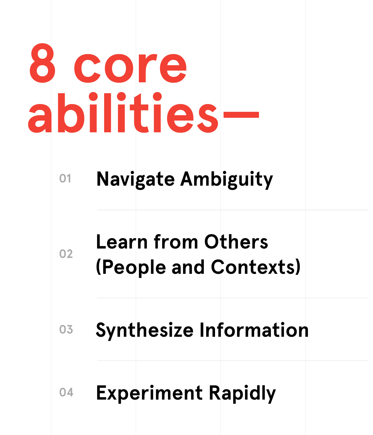
"8 core abilities" in red above a numbered list starting with Navigate Ambiguity and Learn from Others
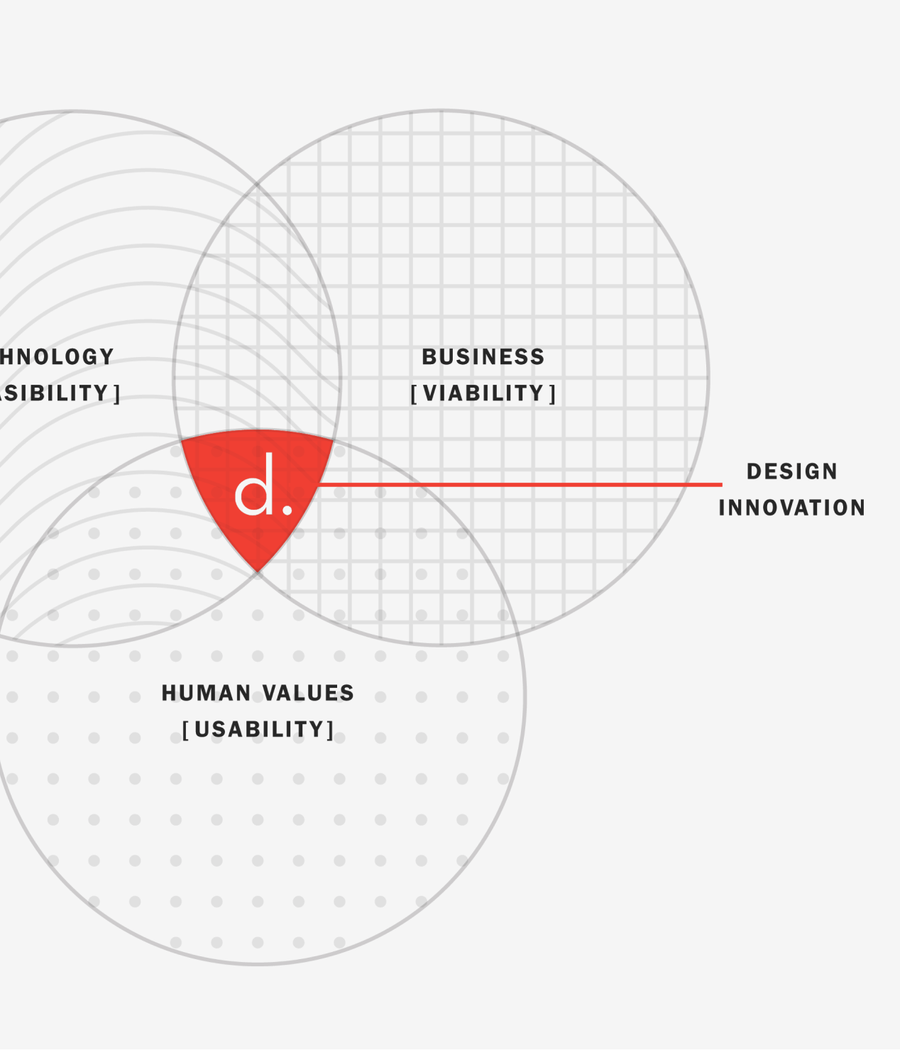
Close-up of the design innovation Venn diagram: line, grid and dot patterned circles meeting at a red "d."
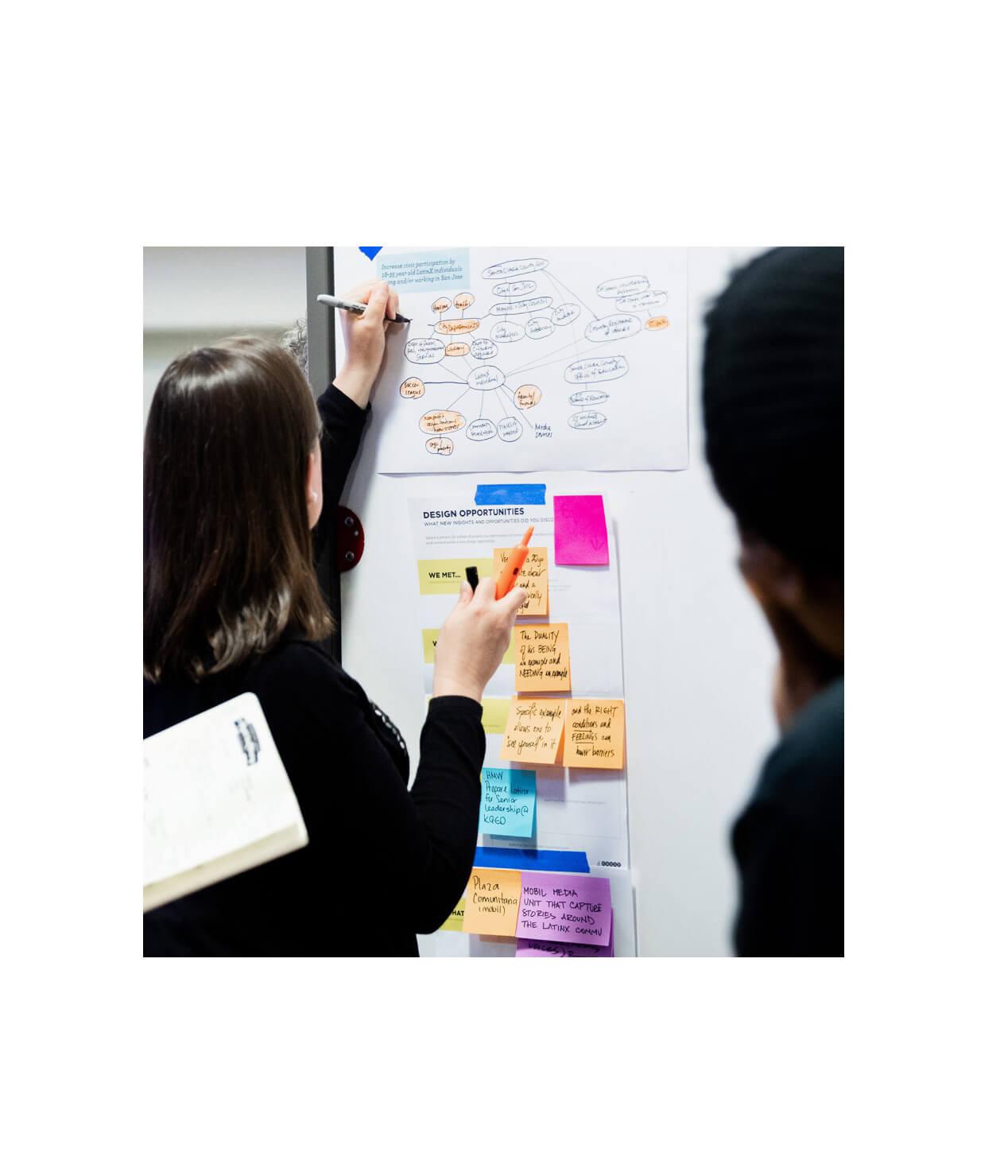
Two people adding to a mind map and colored sticky notes on a wall poster titled "Design opportunities"
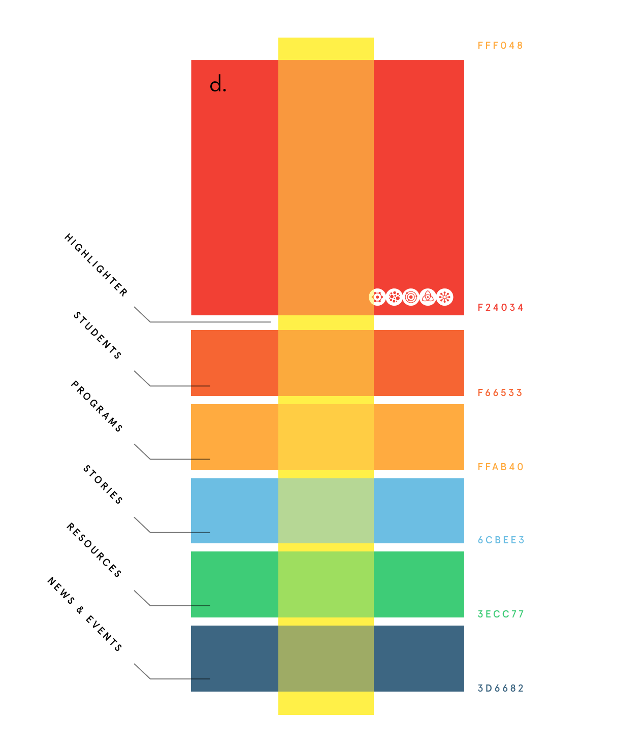
Color palette chart: red, orange, blue, green and navy bands labeled by site section, crossed by a yellow stripe

Systemization

We approached the site with a series of principles: give people tools and minimize restrictions. Use design to provide structure and consistency, not constraints. Embrace the change. And finally, keep things modular to offer options for people adding to the site. We applied the visual aesthetic to these principles and used them as building blocks for a cohesive and beautiful website.

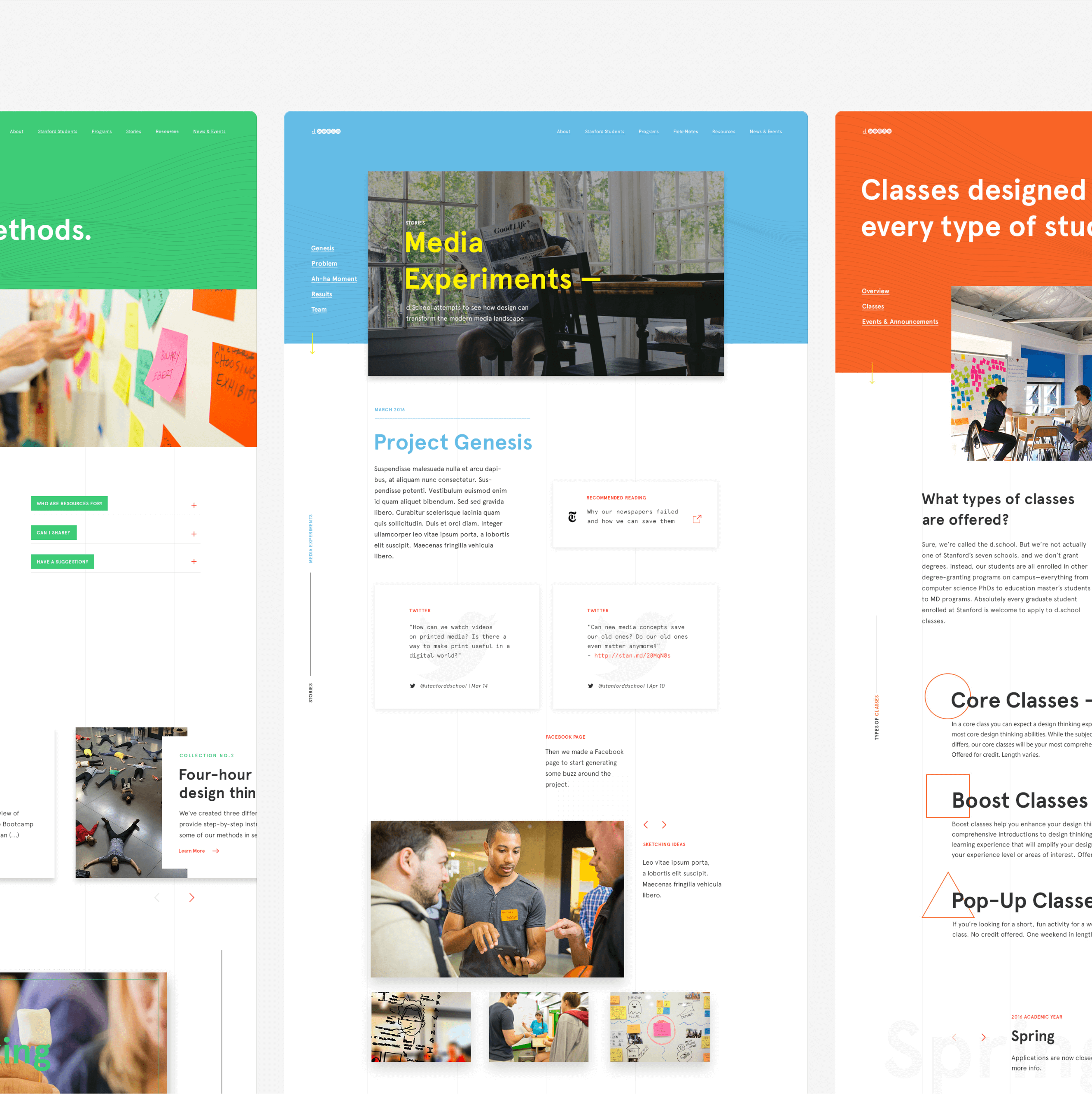
Three d.school page designs with green, blue and orange headers, including "Media Experiments" and a classes page
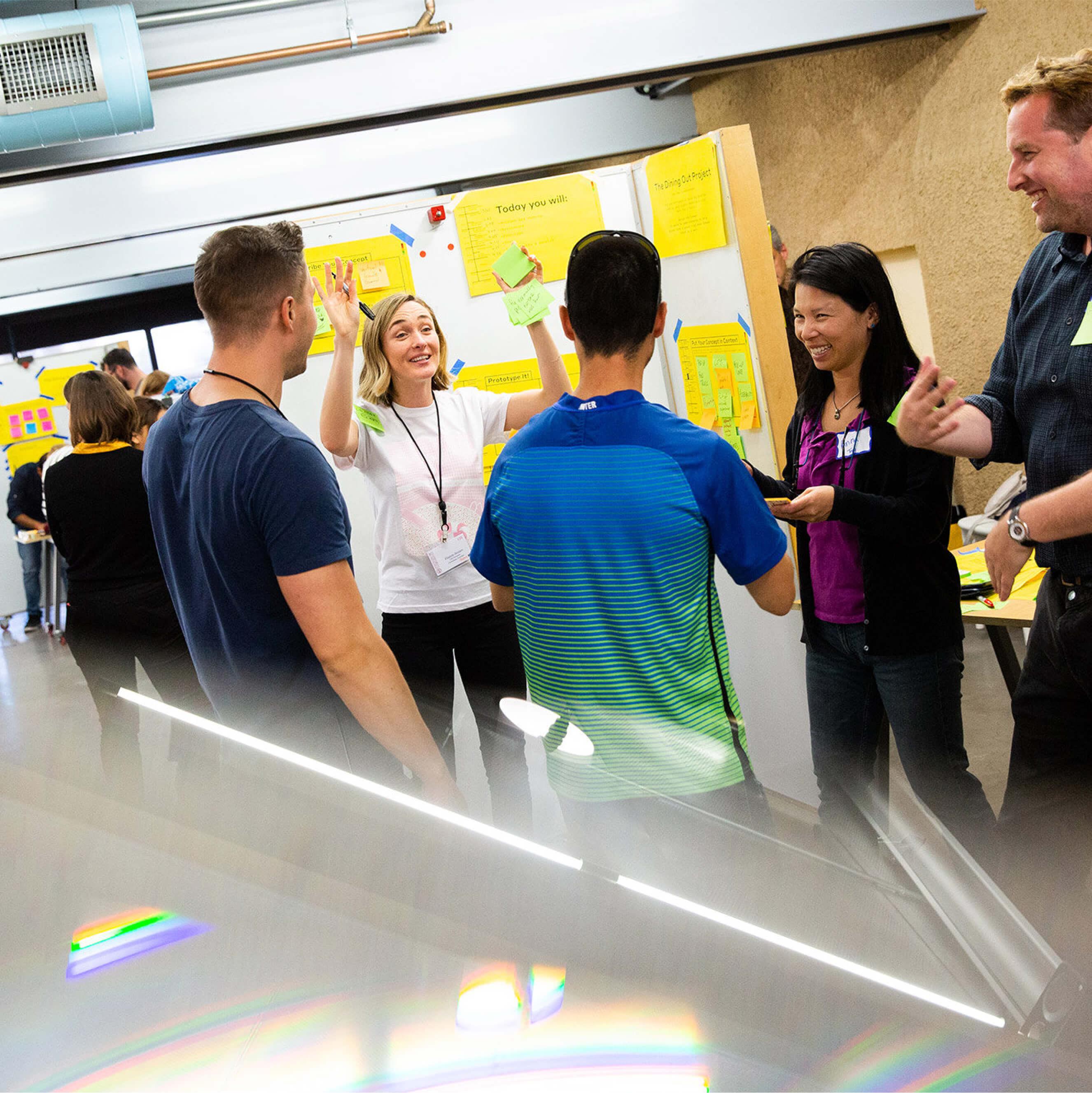
Workshop group around a board of yellow posters; a woman raises both hands holding green sticky notes
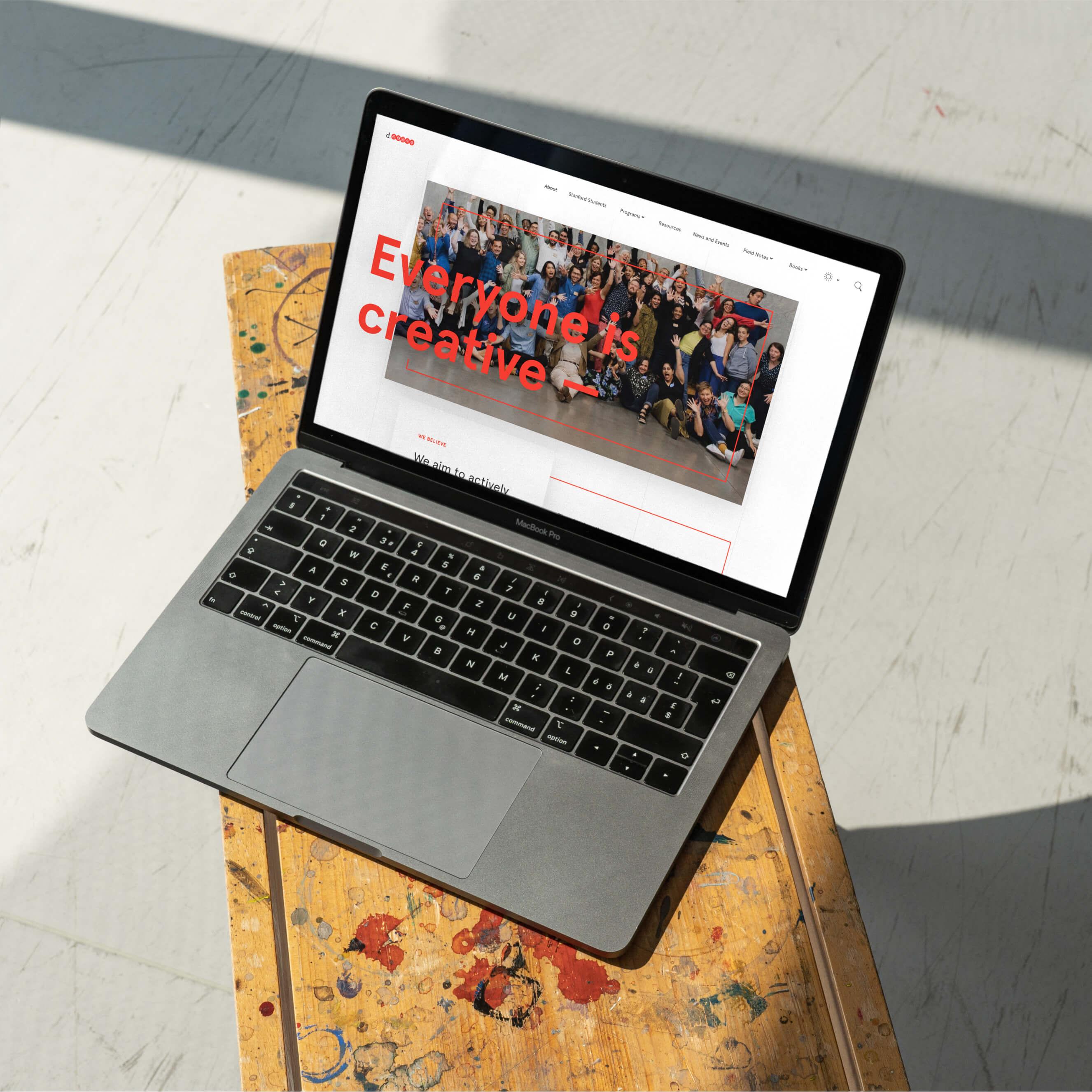
Laptop on a paint-splattered stool showing the d.school site: "Everyone is creative" over a group photo
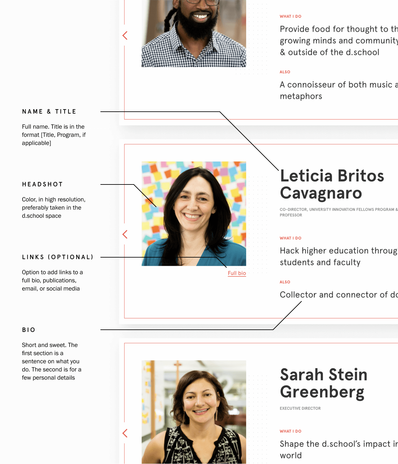
Annotated people-page layout: staff profile cards with callouts for name and title, headshot, links and bio
Four people gathered around a table covered in note cards, one woman leaning in to speak
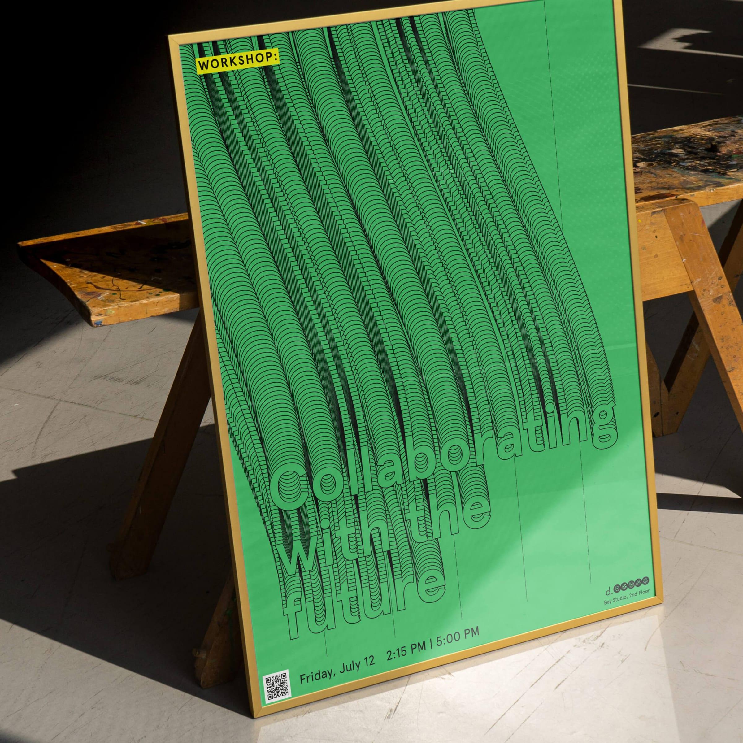
Framed green workshop poster reading "Collaborating with the future", the letters trailing into long outlined tubes

Press & Awards

Awwwards

Awwwards

Honorable Mention, 2017
CommArts

CommArts

Webpick, 2017

Webby Awards

Webby Awards

Nominee, 2018

Up next

Swipe